New to Falcon Next-Gen SIEM? Start with these commonly-used query functions
Falcon Next-Gen SIEM is an AI-native, cloud-scale SOC engine, built to unify lightning search, threat detection, and incident response for faster, clearer investigations. This guide introduces security analysts to Falcon Next-Gen SIEM’s most commonly-used functions through realistic security scenarios. At the end of each scenario, you’ll apply these functions to your security data and practice writing queries for threat detection and investigation. Let’s get started!
Core Functions Covered:
- timeChart()
- window()
- avg()
- min()
- max()
- bucket()
- eval()
- select()
- groupBy()
- table()
- sort()
- case
- count()
- tail()
- selectLast()
- sankey()
Scenario 1: Detecting Anomalous Network Traffic Patterns
Imagine you’re a SOC analyst monitoring network traffic for a financial services company. You’ve been asked to establish baseline network behavior and identify anomalies that could indicate data exfiltration or command-and-control (C2) communication. You want to analyze the minimum, maximum, and average data transfer volumes at different times over the past week to detect unusual patterns. Here’s how:
First, filter your field columns in the fields list with the word “byte” to see fields relevant to network traffic:
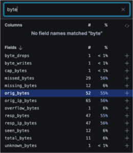
Here you discover two fields critical for detecting data exfiltration: orig_bytes (outbound data) and resp_bytes (inbound data). Removing the filter, you also discover the duration field, which can help identify long-lived connections typical of C2 traffic.
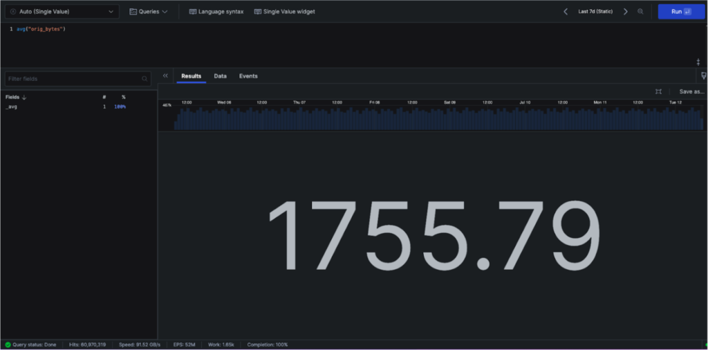
You can start with avg() to get the average of the original bytes over the selected time period (in this case, the last 7 days) as follows:
However, instead of seeing an average over the week, you want to detect when data transfer volumes deviate from normal patterns. Try a timechart to create time-series visualizations showing how metrics change over specified time periods:
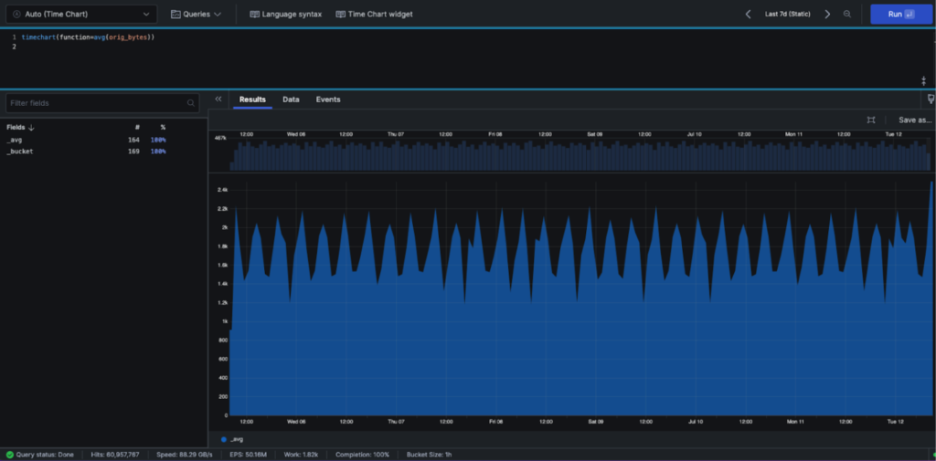
timechart(function=avg(orig_bytes))
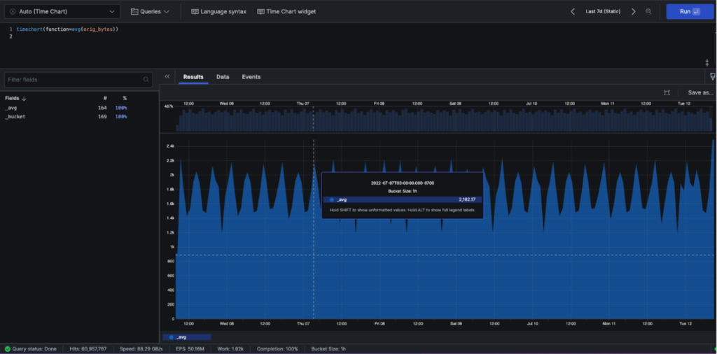
Hovering over the chart, you can see the bucket size is one hour. This makes sense, since you have 169 buckets, and 24 hours/day x 7 days/week is 168 hours in your one-week chart
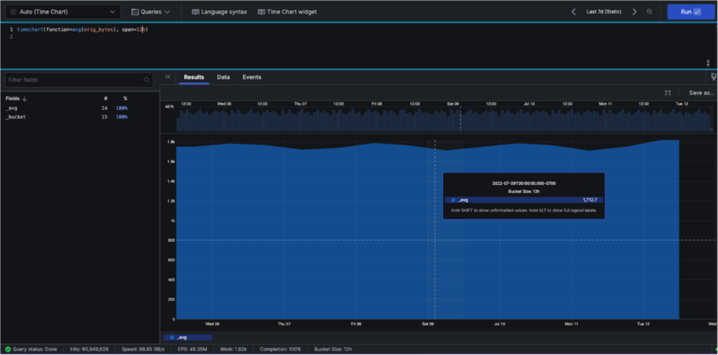
What if you wanted to change the number of buckets to identify more granular anomalies? We can add the span command to our timechart query:
timechart(function=avg(orig_bytes), span=12)
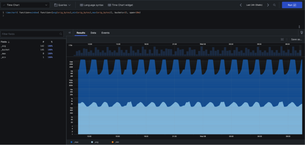
After consulting with your security team lead, you decide the best span to show would be 10 minutes to catch short-duration exfiltration attempts. But when computing the avg, min and max values, you want to compute across three 10-minute windows to establish a rolling baseline for anomaly detection. You can do this with the window command inside our timechart query, as shown below. You’ll see we’ve combined our avg(), min() and max() functions into a single timechart.
Another way of achieving the same result would be to remove the window() function and set the span to 30m. We used the method below to introduce the window() function. In practical situations, the window() function is used to look across buckets along with something else. For example, you could calculate the standard deviation from the last three buckets and detect if the current bucket represents an outlier—a key technique for identifying anomalous data transfers that could indicate compromise.
timechart(function=window(function=\\[avg(orig_bytes),min(orig_bytes),max(orig_bytes)\\]], buckets=3), span=10m)
Here we queried the orig_bytes field, but we can also create similar timecharts for the duration and resp_bytes fields to build a comprehensive view of network behavior and identify multi-dimensional anomalies. We could save each of the timecharts as widgets on a security dashboard for continuous monitoring and threat hunting. This simple query introduced us to numerous useful functions: timechart(), window(), bucket(), avg(), min() and max(). How could you use these functions to establish baselines and detect anomalies in your network traffic?
Next, let’s assume you want to see the values in kilobytes (kb) instead of bytes for easier analysis of potential data exfiltration volumes. We can create a new field by performing some math on an existing field using eval:
eval(sizeInKb=resp_bytes / 1000)
Activity: Take a moment to write a query using timechart(), window(), bucket(), avg(), min() and max() with your network traffic or endpoint telemetry data. Try different values for bucket and span. Consider: What time granularity would help you detect different types of threats—fast-moving ransomware vs. slow data exfiltration? Play with the formatting of your chart by selecting the paintbrush icon on the right to expand the format panel. From there, change the y-axis scale from linear to logarithmic. How does this help you spot outliers that might indicate malicious activity?
Scenario 2: Investigating Web Application Attacks
Imagine you’re a security analyst and you just received a SIEM alert about a potential web application attack that started 30 minutes ago. Multiple HTTP error codes are being generated, potentially indicating a brute force attack, SQL injection attempts, or application exploitation. Your web application firewall logs show unusual patterns.
Our first thought is to inspect HTTP status codes, as these can indicate attack patterns, their frequency, and when the attack began.
First we browse our fields and observe the method field. By clicking it, we see values of GET, PUT, POST, HEAD, OPTIONS, DELETE and PATCH. This indicates the HTTP operation that was requested. We make a mental note that we’ll be interested in GET and POST operations, as attackers often use GET for reconnaissance and POST for exploitation attempts.
Which field will show the attack indicators? Continuing to browse the fields list, we see the statuscode field. Clicking it shows a range of values: 201, 404, 500, 400 and more. These are the HTTP status codes we’re interested in. The 400 series indicates client errors (often from malformed attack payloads) and 500 series represents server-side errors (potentially from successful exploitation attempts). So we begin with a simple query:
method = GET | statuscode >=400
From here, we might want to pull out just the statuscode and timestamp field for each event to build an attack timeline. We can do that with a select query:
method = GET | select([“statuscode”, “@timestamp”]) | statuscode >=400
From here, what if we group the log lines into categories by statuscode. This will allow us to see which attack pattern was most frequent. We use the groupby function.
method = GET | statuscode >= 400 | groupby(statuscode)
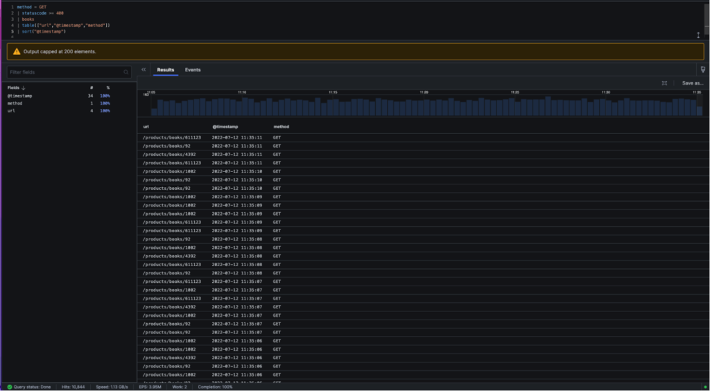
To display a table of URLs targeted by the attacker which return an HTTP status code of 400 or higher, we can use the table command below. The first three lines (method, statuscode and books) serve as filters to ensure we’re looking at only the most relevant
attack-related logs meeting all three criteria.
Method = GET
| statuscode >= 400
| books
| table([“url”,”@timestamp”,”method”])
Next, we can sort by timestamp to reconstruct the attack sequence. You can experiment with other ways to achieve the same result. For instance, the table() function has a sort() argument that defaults to timestamp as well.
statuscode>=400 | method=GET | books
| table(["url","@timestamp","method"])
| sort("@timestamp")
This scenario taught us how to use select(), sort(), groupby() and table() for attack investigation and timeline reconstruction.
Activity: Log into Next-Gen SIEM and create a table with your web application firewall or proxy logs. Which fields did you capture? Which field did you sort by? What attack patterns can you identify? Can you distinguish between reconnaissance, exploitation attempts, and successful compromises?
Scenario 3: Threat Hunting for Known Malicious Infrastructure
You’re a threat hunter investigating indicators of compromise (IOCs) related to a known threat actor campaign. Imagine you receive threat intelligence that 213.155.151.149 is the IP of a known APT group’s command-and-control server, and you want a field that quickly alerts you when any system in your environment communicates with this malicious infrastructure. You could use a case statement below to create a new field and assign it a value of true when the IP is involved and false when the suspicious IP is not involved.
case {
tx_hosts[0] = "213.155.151.149"
| knownthreat := true; *
| knownthreat := false}
To check our work, we use the select and sort functions we covered earlier:
case {
tx_hosts[0] = "213.155.151.149"
| knownthreat := true; *
| knownthreat := false}
| select(["tx_hosts[0]","knownthreat"])
| sort(knownthreat)
You’ll notice that all tx_hosts[0] with an IP of 213.155.151.149 show the knownthreat value of true, whereas any other IP addresses, or even null IP addresses, show a value of false – success!
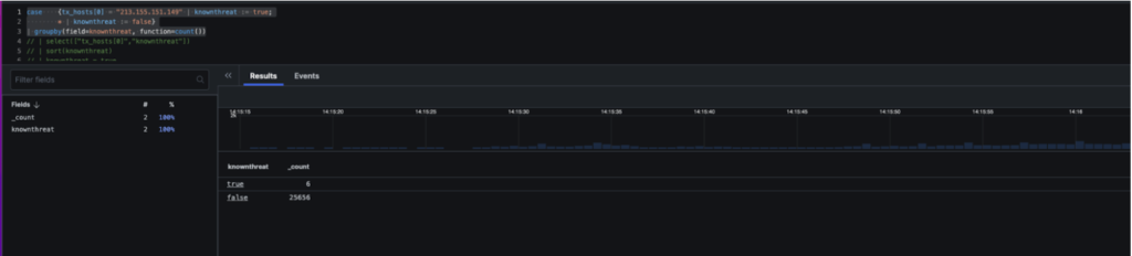
Let’s say we want to count how many potential compromised systems have communicated with this threat actor infrastructure. We could use the count command as follows:
case {
tx_hosts[0] = "213.155.151.149"
| knownthreat := true; *
| knownthreat := false}
| groupby(field=knownthreat, function=count())
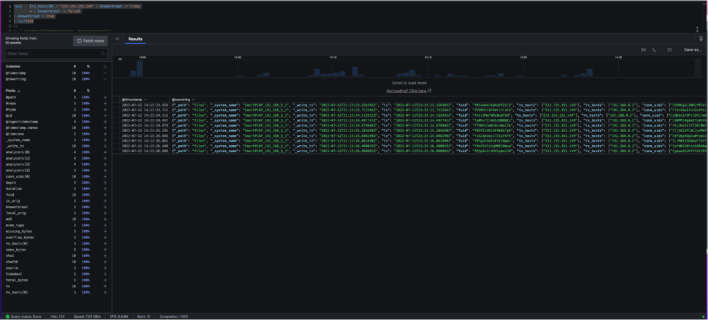
Imagine you want to focus on the 10 most recent beaconing events where this suspicious IP address was involved to identify the most recently compromised systems. You could use the tail() function with a value of 10:
case {
tx_hosts[0] = "213.155.151.149" | knownthreat := true; *
| knownthreat := false}
| knownthreat = true
| tail(10)
Which produces the following:
An alternative to tail() is selectLast(). Here we only want the last, or most recent, value of a given field. Let’s use this to see the most recent compromised internal hosts and the malicious external infrastructure they’re communicating with for both our suspicious IP and a non-suspicious IP address:
case {
tx_hosts[0] = "213.155.151.149"
| knownthreat := true; *
| knownthreat := false}
| groupby(knownthreat, function=selectLast(["tx_hosts[0]","rx_hosts[0]"]))
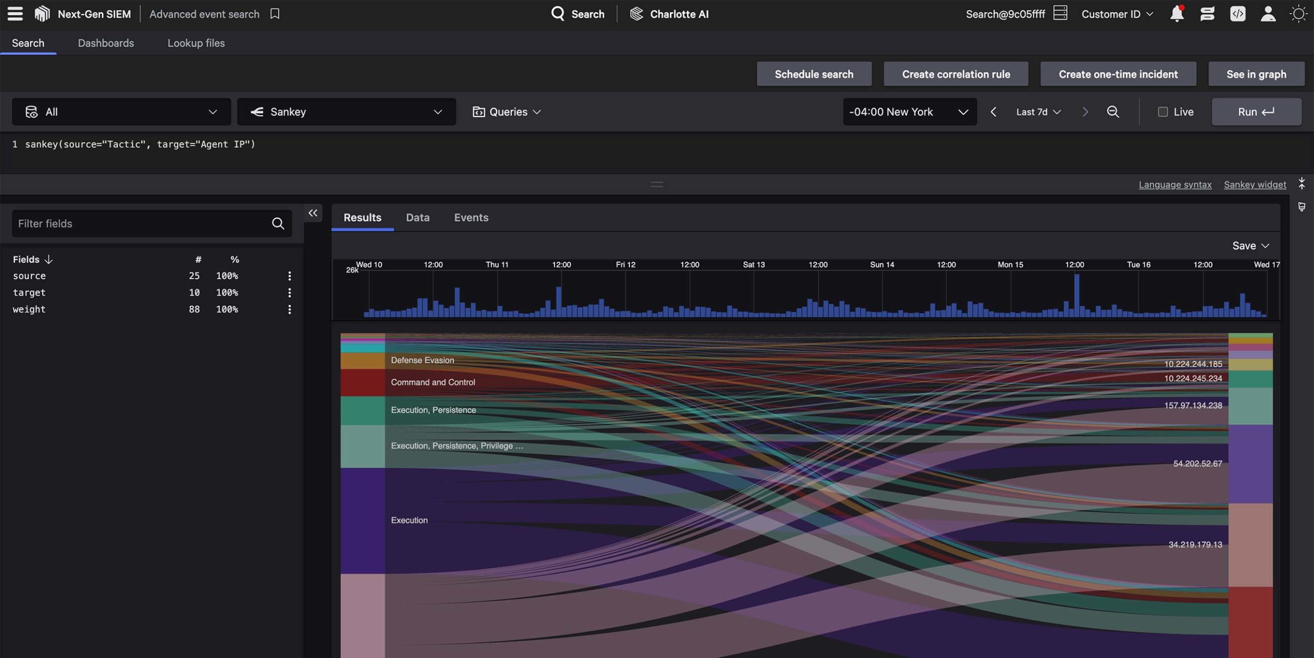
To finish this scenario, let’s visualize the lateral movement and C2 communication patterns between the machines sending and receiving this suspicious traffic. To do this, we’ll use a sankey diagram, where all you need to do is supply the source and target, per the example below:
#path = "files" and mime_type = "*flash"
| sankey(source=rx_hosts[0],target=tx_hosts[0])
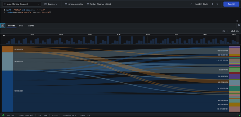
That’s it! In this scenario we covered case statements, sankey diagrams, counting the number of security events and filtering for only the last “x” number of events with tail() or the most recent values for given fields using selectLast—all critical techniques for threat hunting and incident response.
Now it’s time for you to go hunting for suspicious activity within your network traffic using the strategies we employed above. Consider: What other IOCs could you hunt for? How would you expand this query to detect multiple threat actor IPs? How could you automate alerting when new communications with known malicious infrastructure are detected?
Additional Resources
- Discover how Next-Gen SIEM solves for exponential data growth.
- Find out how to modernize your SOC in The Complete Guide to Next-Gen SIEM.
- Learn how to stop phishing and identity-based attacks with 10GB/day of free third-party data ingestion, available to CrowdStrike Falcon® Insight XDR customers.
- Want to go deeper? Check out the CrowdStrike Query Language documentation.