


![Helping Non-Security Stakeholders Understand ATT&CK in 10 Minutes or Less [VIDEO]](https://assets.crowdstrike.com/is/image/crowdstrikeinc/video-ATTCK2-1?wid=530&hei=349&fmt=png-alpha&qlt=95,0&resMode=sharp2&op_usm=3.0,0.3,2,0)
![Qatar’s Commercial Bank Chooses CrowdStrike Falcon®: A Partnership Based on Trust [VIDEO]](https://assets.crowdstrike.com/is/image/crowdstrikeinc/Edward-Gonam-Qatar-Blog2-1?wid=530&hei=349&fmt=png-alpha&qlt=95,0&resMode=sharp2&op_usm=3.0,0.3,2,0)


?wid=2048&hei=1350&fmt=png-alpha&qlt=95,0&resMode=sharp2&op_usm=3.0,0.3,2,0)


My last blog post discussed the rationale for CrowdScore® and outlined its evidence-weighting approach, demonstrating a 10- to 25-fold improvement in the ability to accurately distinguish between malicious and benign behavior. Using cloud-based AI analytics, the real-time CrowdScore system uses an incident-centric model to provide better prioritization for analyst attention and to distill CrowdStrike Falcon® platform’s endpoint detection and response (EDR) data into a simple metric for operations managers and CxOs.
In this blog, I show how we can accurately measure an important aspect of security with a detection performance metric. I will then use that model to demonstrate the improvement that CrowdScore represents when compared against today’s standard alert triage practice.
Detection efficacy is often thought of as only indicating whether or not an alert was raised related to some malicious activity. However, an often overlooked aspect of detection is increasing the number of true positives found, compared to the number of false positives triaged.
In the last CrowdScore blog post, we looked at how most EDR solutions take a naive approach to tuning false positives that actually ends up introducing false negatives. In any case, we need to make sure that the efficacy measurement we decide to use takes both true and false positives into account.
 Once we introduce prioritization of higher fidelity detections, the line will actually turn into a curve — a desirable effect that reduces the pain for a certain amount of gain. In addition, we need to recognize the fact that a SOC (security operations center) has a finite amount of capacity that we want to utilize as efficiently and effectively as possible.
 We must then choose to investigate some alerts and ignore others, or we must stop developing new types of alerts. This is the dilemma that yielded alert prioritization, a ubiquitous concept in the security industry, and most commonly referred to as "confidence" or "severity." The nuance that some distinction might usefully exist between these two terms is arguably irrelevant since, in the end, some basis must be used for prioritizing alerts.
This dilemma also yielded the concept of tuning, which we discussed in the previous post. Adding prioritization improves the situation somewhat, though as we shall see later, not as much as the situation can be improved by CrowdScore. The upshot is that we have to ignore some alerts — the question is, “Which alerts most deserve our attention?” By recognizing that some alerts are higher fidelity than others, and by prioritizing triage of those detects, we can improve the efficiency of the SOC.
In the following chart we categorize the alerts previously defined into four alert levels that are labeled "Critical," "High," "Medium" and "Low.” Next, we assign our alerts to each level according to their fidelity and then prioritize triage activities, preferring to first investigate higher fidelity alerts. This moves the critical alerts to the left, followed by high, medium and low. This follows the fact that, as mentioned earlier, higher severity alerts tend to have a higher true positive rate.
We must then choose to investigate some alerts and ignore others, or we must stop developing new types of alerts. This is the dilemma that yielded alert prioritization, a ubiquitous concept in the security industry, and most commonly referred to as "confidence" or "severity." The nuance that some distinction might usefully exist between these two terms is arguably irrelevant since, in the end, some basis must be used for prioritizing alerts.
This dilemma also yielded the concept of tuning, which we discussed in the previous post. Adding prioritization improves the situation somewhat, though as we shall see later, not as much as the situation can be improved by CrowdScore. The upshot is that we have to ignore some alerts — the question is, “Which alerts most deserve our attention?” By recognizing that some alerts are higher fidelity than others, and by prioritizing triage of those detects, we can improve the efficiency of the SOC.
In the following chart we categorize the alerts previously defined into four alert levels that are labeled "Critical," "High," "Medium" and "Low.” Next, we assign our alerts to each level according to their fidelity and then prioritize triage activities, preferring to first investigate higher fidelity alerts. This moves the critical alerts to the left, followed by high, medium and low. This follows the fact that, as mentioned earlier, higher severity alerts tend to have a higher true positive rate.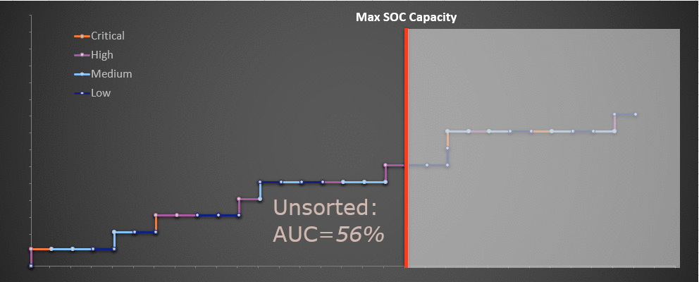 The important thing to note about the chart above is that even though our SOC capacity has remained the same, and even though the alerts remain the same, we are able to identify more true positives by the time our SOC capacity is exhausted.
And since we have prioritized on this basis, the alerts that remain untriaged due to capacity tend to be low severity. In the end, we increased the number of true positives discovered within our capacity window from 6 to 8, an improvement of 33%. Missed detects decreased from 3 to 2. As a reminder, this data is hypothetical.
The important thing to note about the chart above is that even though our SOC capacity has remained the same, and even though the alerts remain the same, we are able to identify more true positives by the time our SOC capacity is exhausted.
And since we have prioritized on this basis, the alerts that remain untriaged due to capacity tend to be low severity. In the end, we increased the number of true positives discovered within our capacity window from 6 to 8, an improvement of 33%. Missed detects decreased from 3 to 2. As a reminder, this data is hypothetical.
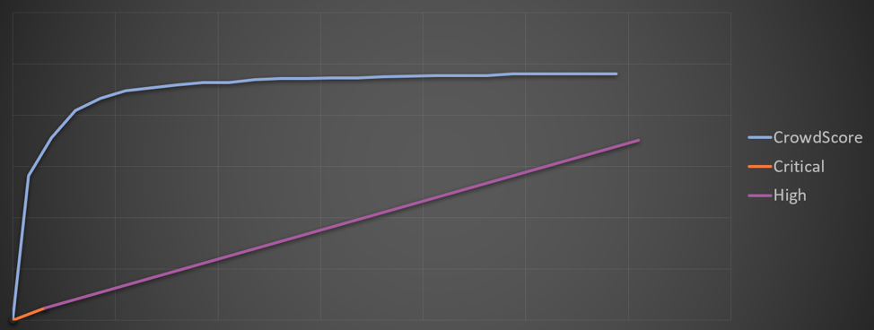 In contrast to the previous charts, the chart above is based on actual measured data. In order to be able to publicly reveal this data, I've had to decimate the data points and take other measures to prevent disclosure of sensitive company information. The result is consistent with the overall performance of the classifiers.
What should be apparent is that CrowdScore's method of prioritizing alert data represents a significant improvement over the ubiquitous and common practice of static assignment of priority levels to alert types. And, CrowdScore results improve naturally with the addition of new alert types, rather than just pushing the detect volume further outside the reach of our SOC's capacity.
In contrast to the previous charts, the chart above is based on actual measured data. In order to be able to publicly reveal this data, I've had to decimate the data points and take other measures to prevent disclosure of sensitive company information. The result is consistent with the overall performance of the classifiers.
What should be apparent is that CrowdScore's method of prioritizing alert data represents a significant improvement over the ubiquitous and common practice of static assignment of priority levels to alert types. And, CrowdScore results improve naturally with the addition of new alert types, rather than just pushing the detect volume further outside the reach of our SOC's capacity.
Measuring Detection Efficacy
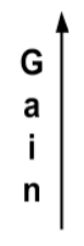
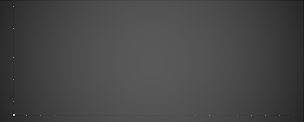
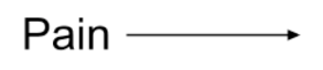
A particularly useful way to measure detection efficacy is to chart the true and false positives we observe. We can do this in the following way, which for now I will refer to as the "Gain versus Pain" chart, though we'll see that it has a more technical name. The data in the next three charts is toy data generated using a Monte Carlo simulation where higher severity alerts also have a higher true positive ratio, though we will start by looking at the data without any severity information.Starting at the origin of the chart, as we are presented alerts from our security system, we plot each alert that we determine to be a true positive as one step up in the vertical direction (Y axis), and each false positive as a step horizontally to the right. The following hypothetical detection data helps illustrate this. The data tends to wander, but on average it will trend in a certain direction corresponding to the long-term average ratio of true positives to the overall number of alerts. So, why bother going through the exercise of plotting this line when a simple ratio captures the performance?
Once we introduce prioritization of higher fidelity detections, the line will actually turn into a curve — a desirable effect that reduces the pain for a certain amount of gain. In addition, we need to recognize the fact that a SOC (security operations center) has a finite amount of capacity that we want to utilize as efficiently and effectively as possible.
Importance of SOC Capacity
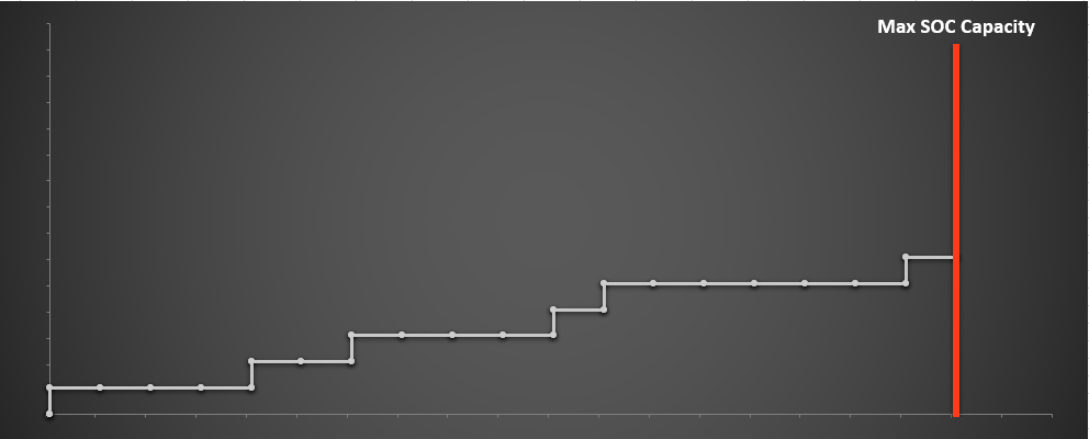
We will define "SOC capacity" as the number of alerts an SOC can effectively triage within some period of time (e.g., 500 alerts per day). The specific number is not as important as the general concept that SOC capacity is not an infinite resource and some limit exists — as challenging as it may be to measure accurately. Over time, SOCs see an ever-increasing number of types of alerts, reflecting improvements in detecting existing malicious activity, as well as in reaction to new malicious activities and a changing threat landscape.Difficult Choices
At the point where the natural rate of the alerts (AKA firing instances of our alerts) exceeds our SOC capacity, we are faced with difficult choices that require us to prioritize our attention. If we had infinite resources, prioritization would not be necessary because we could investigate all alerts with no delay, but unfortunately that is not feasible. The never-ending cycle of alert development inevitably leads to saturating and exceeding the SOC capacity. In short, as we add more detects, the daily volume of alerts increases and exceeds the SOC capacity, as indicated by the vertical red bar in the chart below.
We must then choose to investigate some alerts and ignore others, or we must stop developing new types of alerts. This is the dilemma that yielded alert prioritization, a ubiquitous concept in the security industry, and most commonly referred to as "confidence" or "severity." The nuance that some distinction might usefully exist between these two terms is arguably irrelevant since, in the end, some basis must be used for prioritizing alerts.
This dilemma also yielded the concept of tuning, which we discussed in the previous post. Adding prioritization improves the situation somewhat, though as we shall see later, not as much as the situation can be improved by CrowdScore. The upshot is that we have to ignore some alerts — the question is, “Which alerts most deserve our attention?” By recognizing that some alerts are higher fidelity than others, and by prioritizing triage of those detects, we can improve the efficiency of the SOC.
In the following chart we categorize the alerts previously defined into four alert levels that are labeled "Critical," "High," "Medium" and "Low.” Next, we assign our alerts to each level according to their fidelity and then prioritize triage activities, preferring to first investigate higher fidelity alerts. This moves the critical alerts to the left, followed by high, medium and low. This follows the fact that, as mentioned earlier, higher severity alerts tend to have a higher true positive rate.Now that we have prioritized where our attention goes, more of the alerts we're spending effort on (and fewer of the ones we're ignoring) are true positives.
The important thing to note about the chart above is that even though our SOC capacity has remained the same, and even though the alerts remain the same, we are able to identify more true positives by the time our SOC capacity is exhausted.
And since we have prioritized on this basis, the alerts that remain untriaged due to capacity tend to be low severity. In the end, we increased the number of true positives discovered within our capacity window from 6 to 8, an improvement of 33%. Missed detects decreased from 3 to 2. As a reminder, this data is hypothetical.
Fundamental Limitations on Alert Fidelity
It might be tempting to conclude from the results above that in order to improve the performance of our detection, we should increase the number of severity levels. Unfortunately, going beyond four or so levels does not improve matters. The problem is that alerts themselves, with their context-free rather than context-aware severity assignments, contain too little information to provide a good basis for discriminating between malicious and benign behavior. It seems fairly and intuitively obvious that limiting the amount of information available to a classifier is likely to limit its performance. In addition, ongoing development of new types of alerts tends to favor lower severity alerts. The reasons for this have been described well in other content, most recently in the Pyramid of Pain, but also in various forms earlier, such as in the Intel Value Window. The upshot is that more general and behavioral detection methods tend to require more effort to develop, and have higher false positive rates. Conversely, hashes, domains and IPs tend to fall on the highest fidelity end of the spectrum, but fail to detect new attacks since they are so easy for the adversary to change.Low-Hanging Fruit
The result is that after developing the obvious high-fidelity alerts that are easily in reach, it becomes increasingly difficult to extract any more ore from the mine. Our goal is for the left side of that curve in the chart above to be as steep and to rise as high as possible before turning to the right — maximizing the amount of gain achieved for a given amount of pain. The curve that emerges in that chart gets much more difficult to push higher due to the reasons just described, and largely, the effort to create new alert types ends up extending the long tail of detects further past the limits of our SOC's ability to triage them.Classifiers
The fancy name for the way we have measured our performance is called the Receiver Operating Characteristics (ROC) curve. This is a common way to measure algorithms called "classifiers." In the simplest case, by signaling an alert on some underlying sensor data, we are classifying that data as potentially malicious. One simple metric that can help us compare the performance of various classifiers is the area under the curve (AUC). A higher AUC generally implies a higher performing classifier. When we introduce severity and sort by that severity, the AUC rises from about 48% to 67% in the hypothetical scenario above. Anything around 50% is not good, although it sounds like 67% is a significant improvement. However, we can do better. The following chart, based on actual data, compares the simple per-pattern, severity-sorted classifier with the performance of CrowdScore's incident ranking. Instead of relying on individual alerts, this approach prioritizes on the basis of the weight of contextual evidence for each incident. It is important to note that we are measuring the performance of the classifiers against "ground truth" as determined by human analysts — in particular, our expert threat hunters in the Falcon OverWatchTM team.
In contrast to the previous charts, the chart above is based on actual measured data. In order to be able to publicly reveal this data, I've had to decimate the data points and take other measures to prevent disclosure of sensitive company information. The result is consistent with the overall performance of the classifiers.
What should be apparent is that CrowdScore's method of prioritizing alert data represents a significant improvement over the ubiquitous and common practice of static assignment of priority levels to alert types. And, CrowdScore results improve naturally with the addition of new alert types, rather than just pushing the detect volume further outside the reach of our SOC's capacity.
Conclusion: Time for a Breakthrough
It is high time for a breakthrough in detection technology. CrowdScore represents just such a breakthrough. Equally important, by using robust performance measurement methodologies such as ROC and the associated AUC, we can demonstrate just how much CrowdScore improves the situation with hard data. CrowdStrike takes neither our industry leadership position nor the adversary for granted. CrowdScore is not the final destination for detection on our platform, but one step along the way. We recognize that it is only through constant innovation and advancing the state-of-the-art that we can continue to successfully achieve our mission to protect our customers and stop breaches.Additional Resources
- Learn more about CrowdScore in this blog: “Noise Is the Problem — CrowdScore is the Solution”.
- Read a blog and watch a video of Dmitri Alperovitch discussing CrowdScore.
- Learn more about the CrowdStrike Falcon® Platform by visiting the product webpage.
- Test CrowdStrike next-gen AV for yourself. Start your free trial of Falcon Prevent™ today.


