Endpoint Security
CrowdStrike Tech Hub
Your ultimate resource for the CrowdStrike Falcon® platform: In-depth videos, tutorials, and training.
Select a product category below to get started.
Self-paced Interactive Demo
Falcon Encounter Hands-On Labs
Falcon Identity Protection in Action
Self-paced Interactive Demo
Falcon Encounter Hands-On Labs
Falcon Cloud Security
Self-paced Interactive Demo
Falcon Encounter Hands-On Labs
Next-Gen SIEM Demo Video
Interactive Next-Gen SIEM Demo
Falcon Encounter Hands-On Labs
Falcon Data Protection
Self-paced Interactive Demo
Falcon Encounter Hands-On Labs
Falcon Exposure Management
Self-paced Interactive Demo
Falcon Encounter Hands-On Labs
Falcon for IT
Self-paced Interactive Demo
Falcon Encounter Hands-On Labs
CrowdStrike Counter Adversary Operations
Self-Paced Interactive Demo
Falcon Encounter Hands-On Labs
Charlotte AI
Conversations with Charlotte AI: Malware Families
Falcon Encounter Hands-On Labs
Endpoint Security - Real Time Response
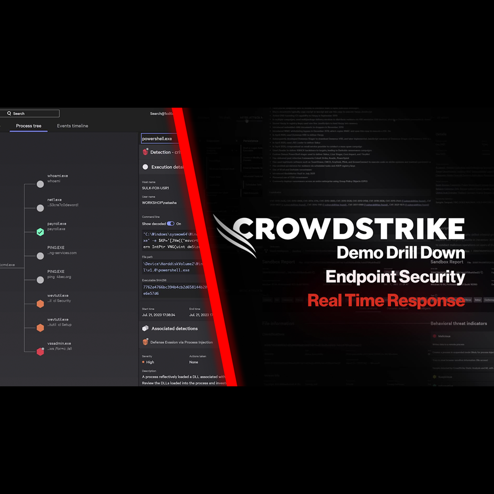
Play Video
Endpoint Security - Automated Remediation
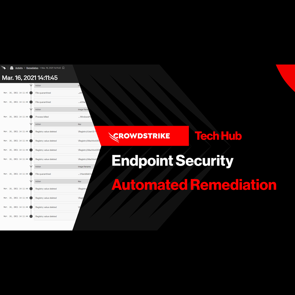
Play Video
Endpoint Security - Falcon Fusion with Real Time Response
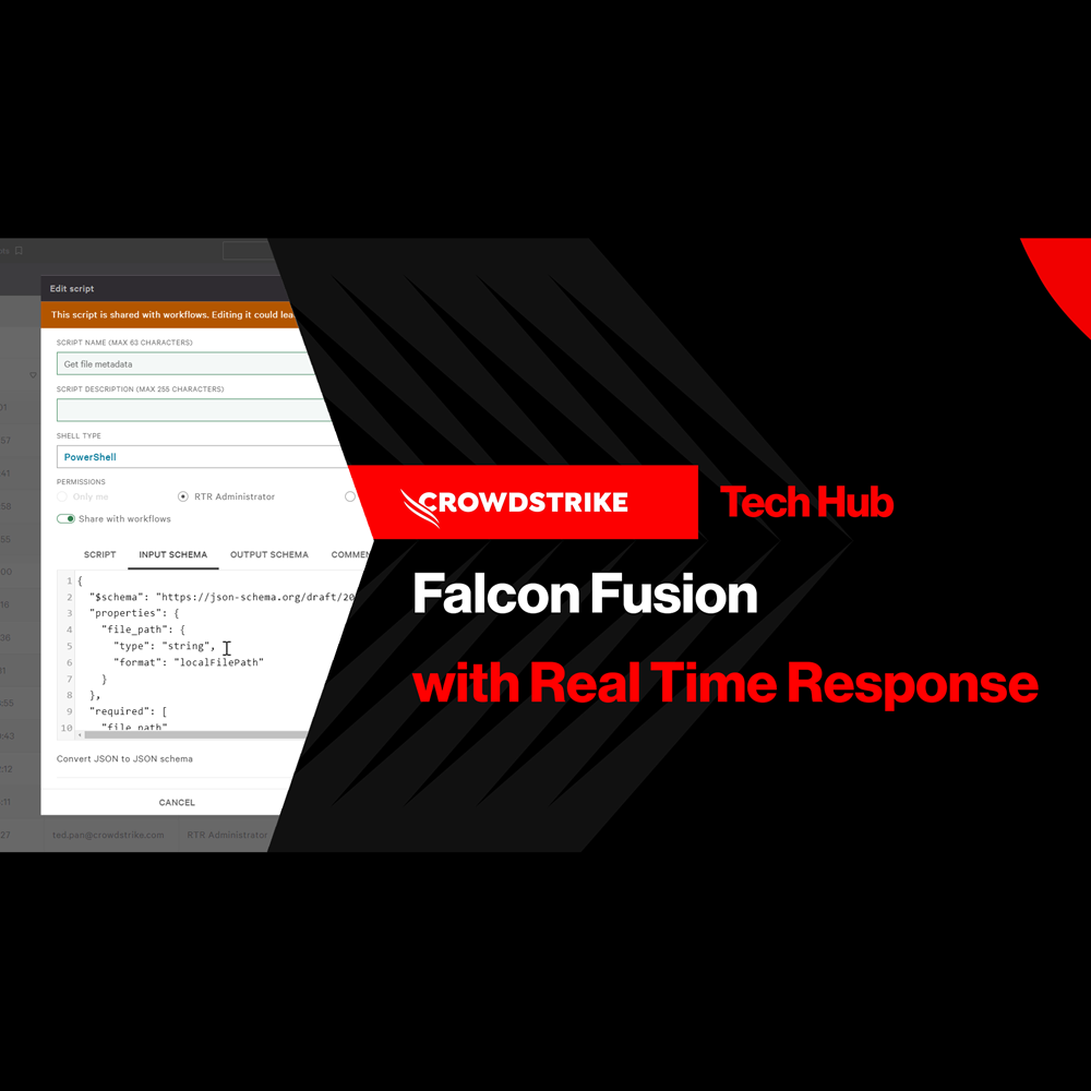
Play Video
Endpoint Security - Customized Dashboards
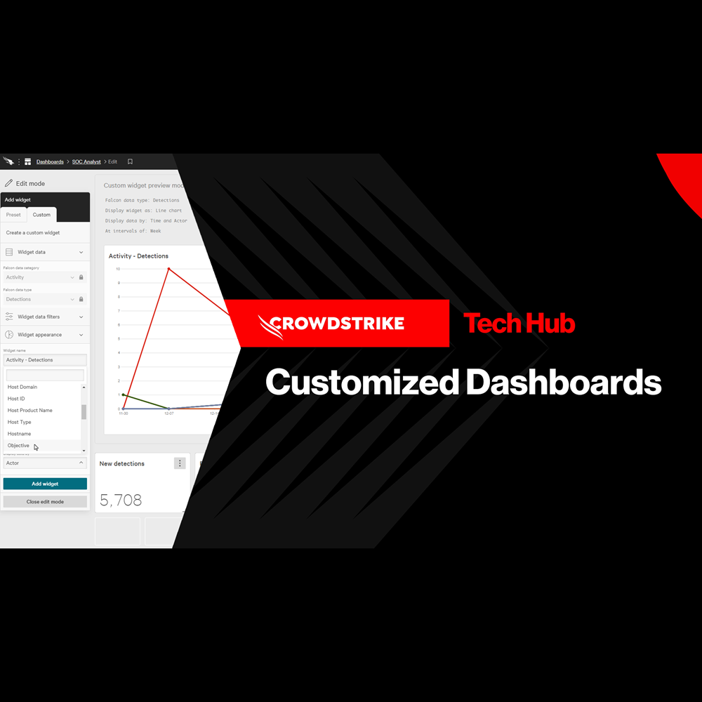
Play Video
Endpoint Security - Context Enrichment
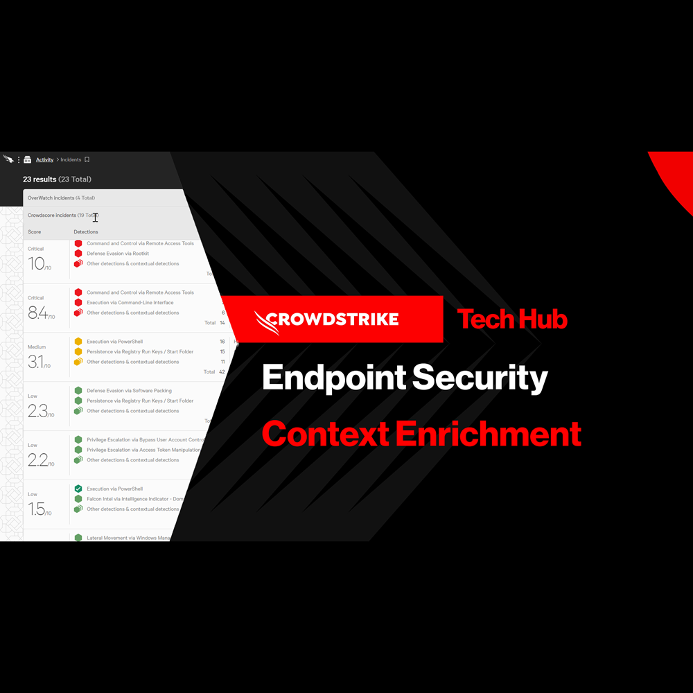
Play Video
Endpoint Security - Falcon Go for Small and Medium Businesses
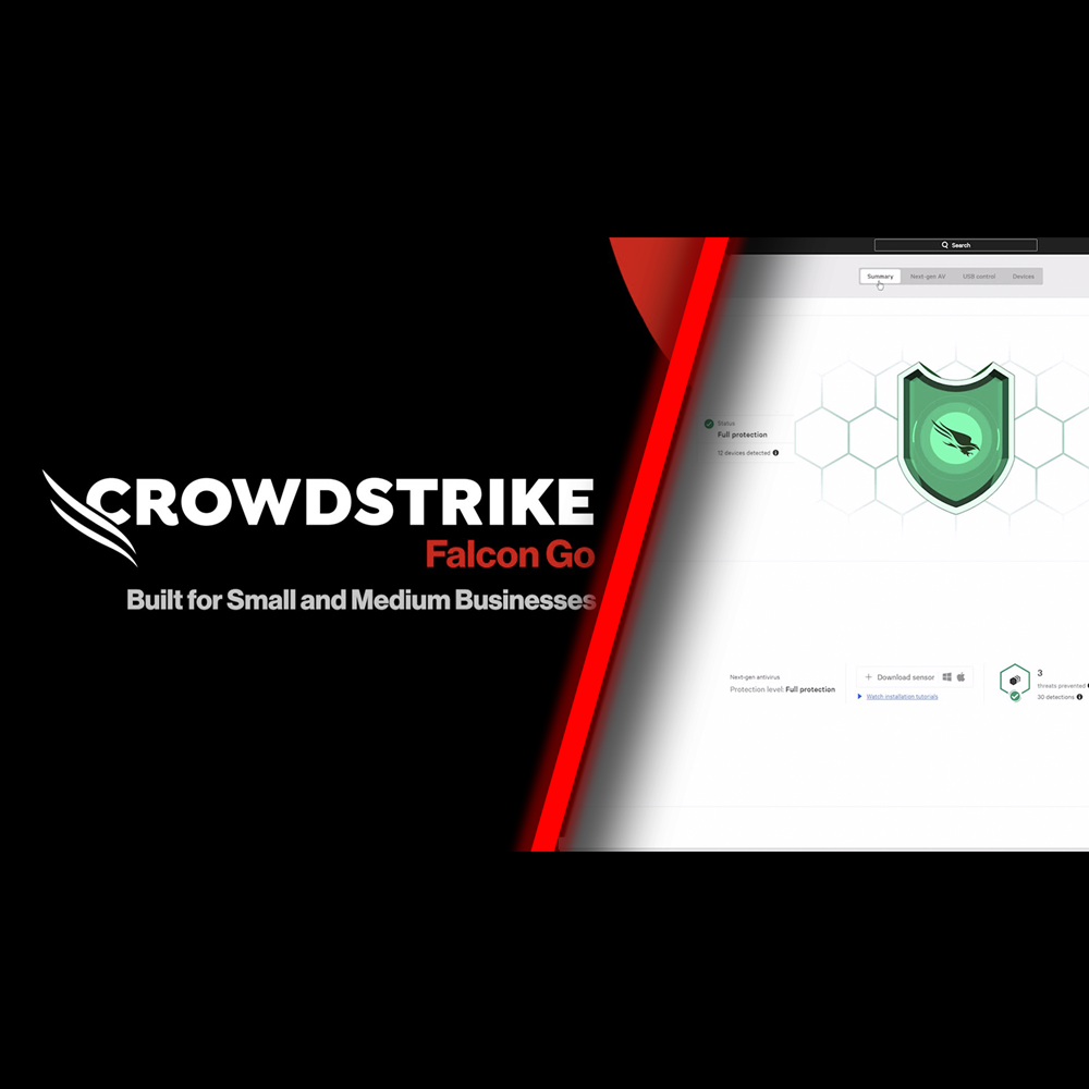
Play Video
Identity Protection - Protect Against Exposed Credentials
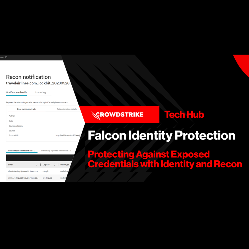
Play Video
Identity Protection - Honeytoken
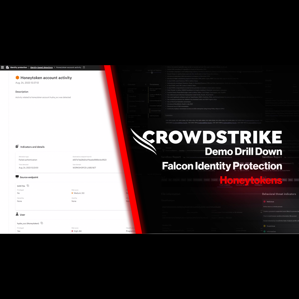
Play Video
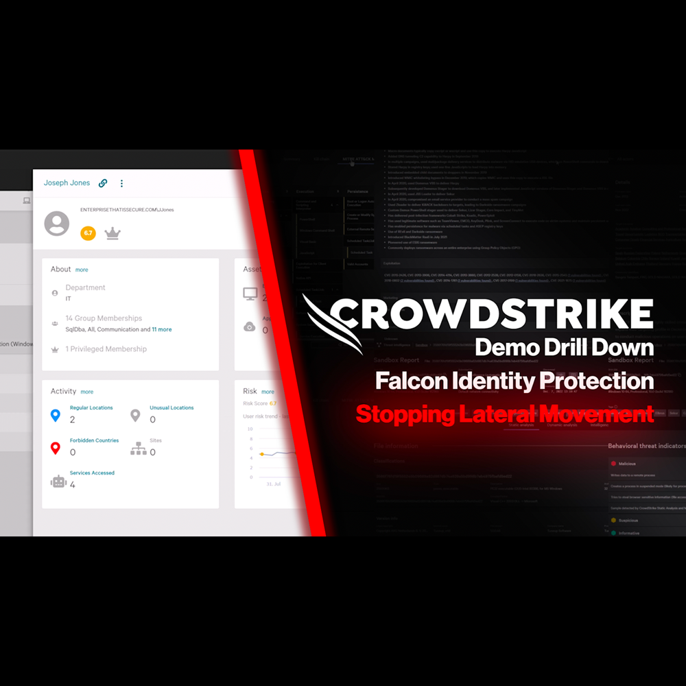
Identity Protection - Stop Lateral Movement
Play Video
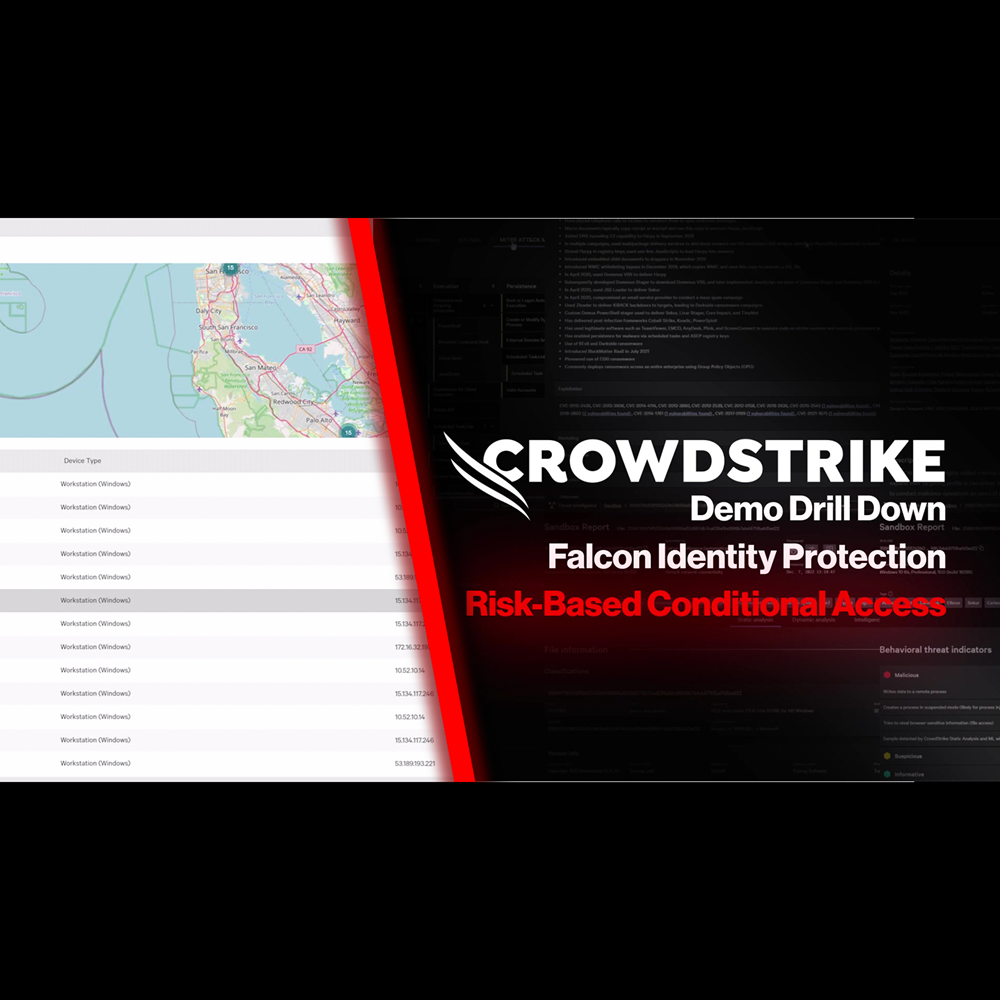
Identity Protection - Risk-Based Conditional Access
Play Video
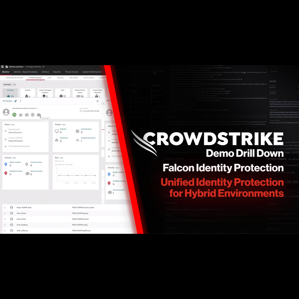
Identity Protection - Protection for Hybrid Environments
Play Video
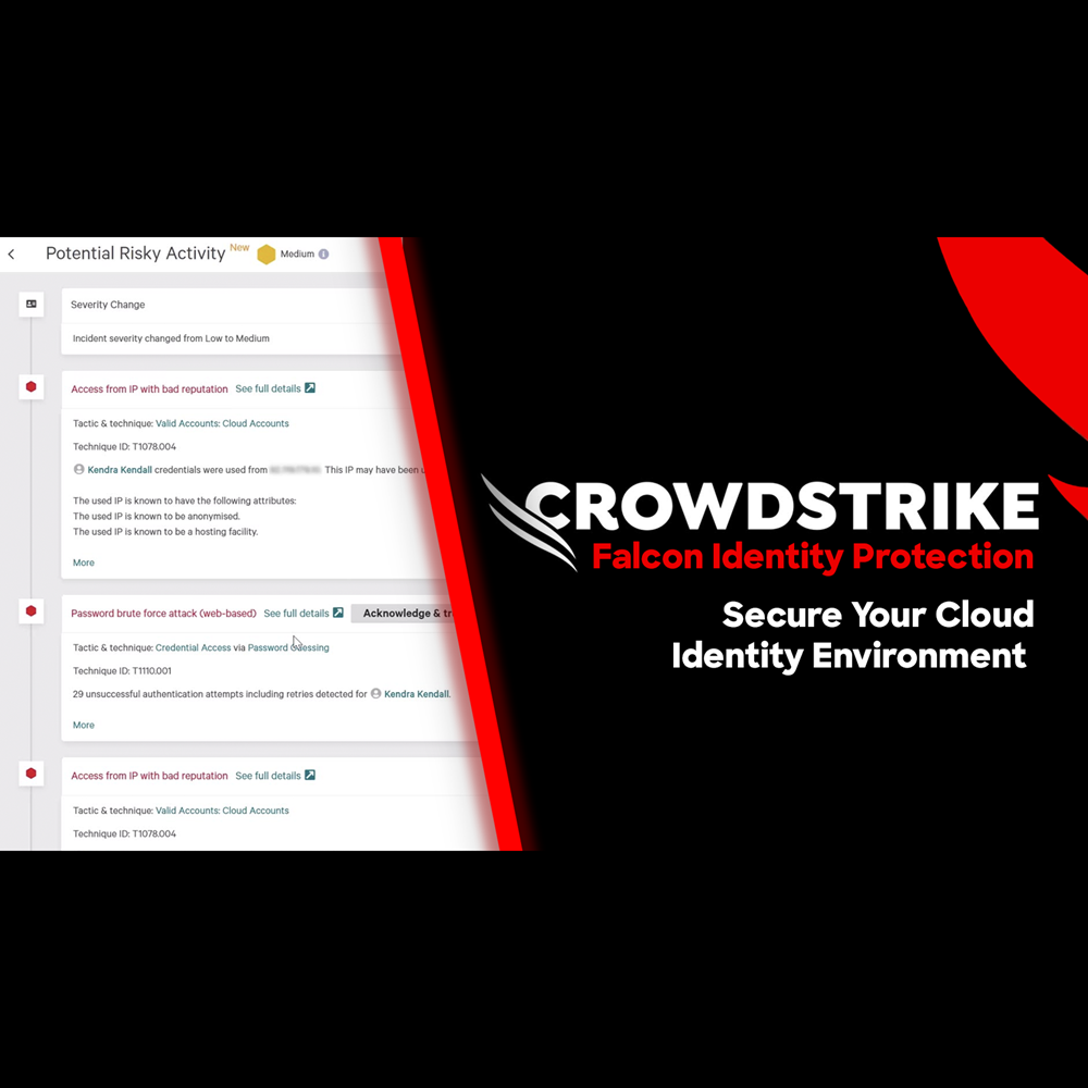
Identity Protection - Secure Your Cloud Identity Environment
Play Video
Cloud Security - Cloud Detection and Response
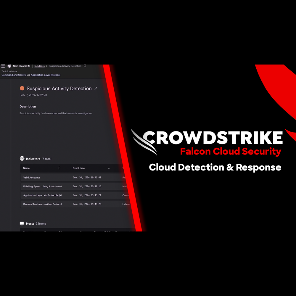
Play Video
Cloud Security - Adversary Attack Path
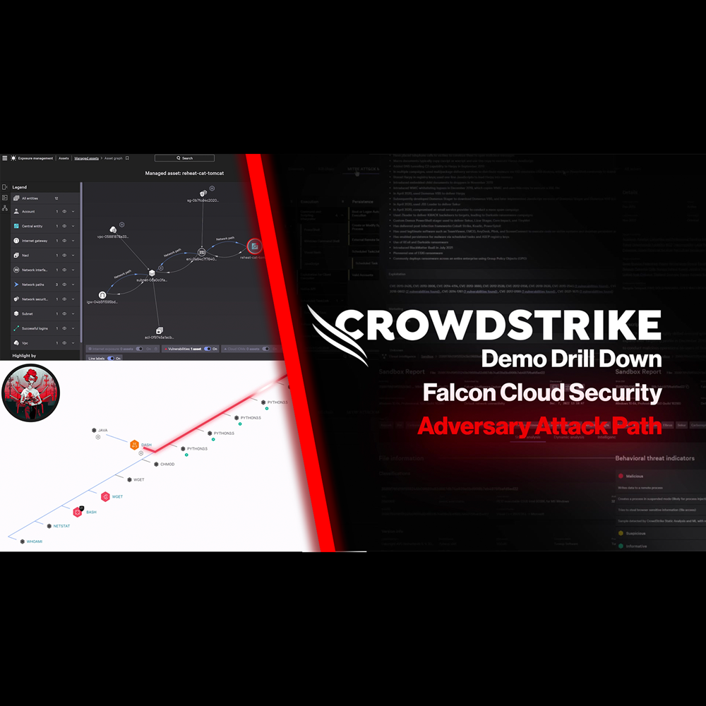
Play Video
Cloud Security - Infrastructure as Code
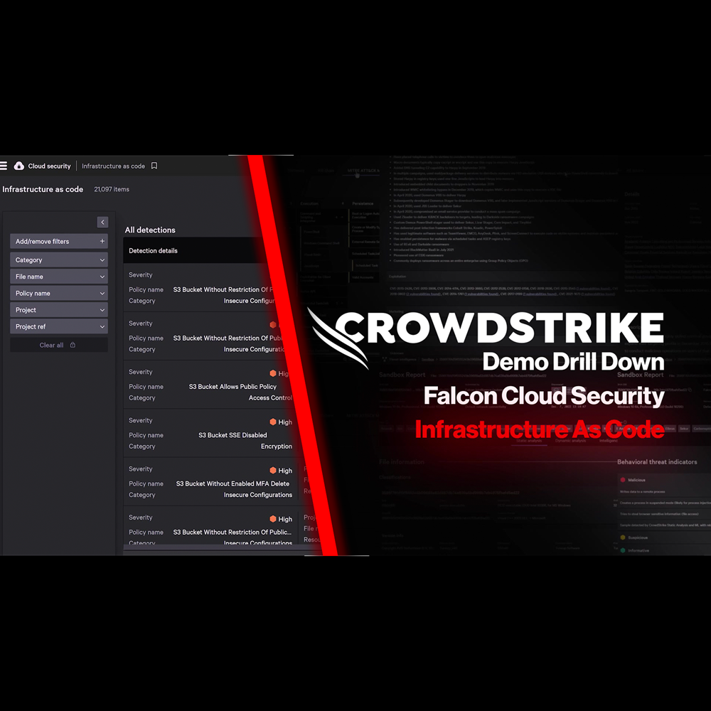
Play Video
Cloud Security - Kubernetes Admission Controller
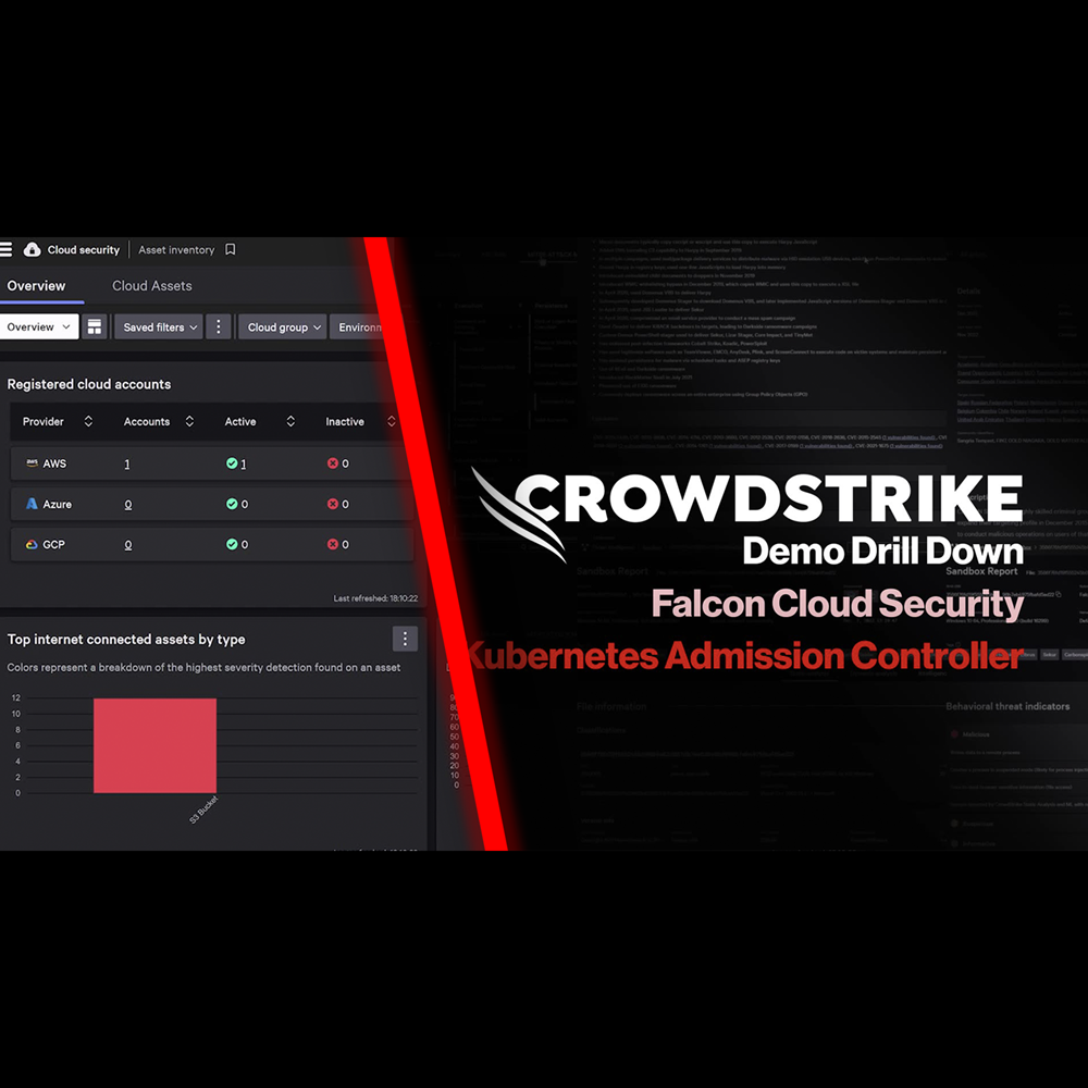
Play Video
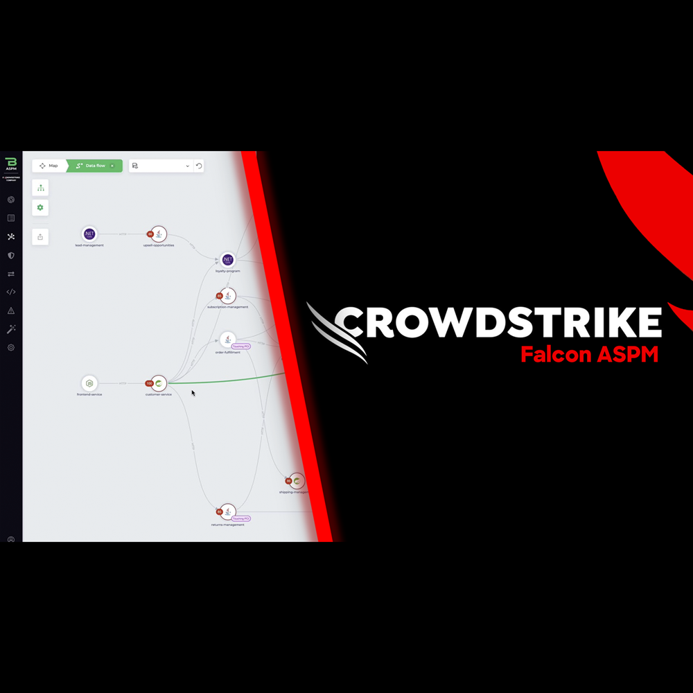
Cloud Security - Application Security Posture Management (ASPM)
Play Video
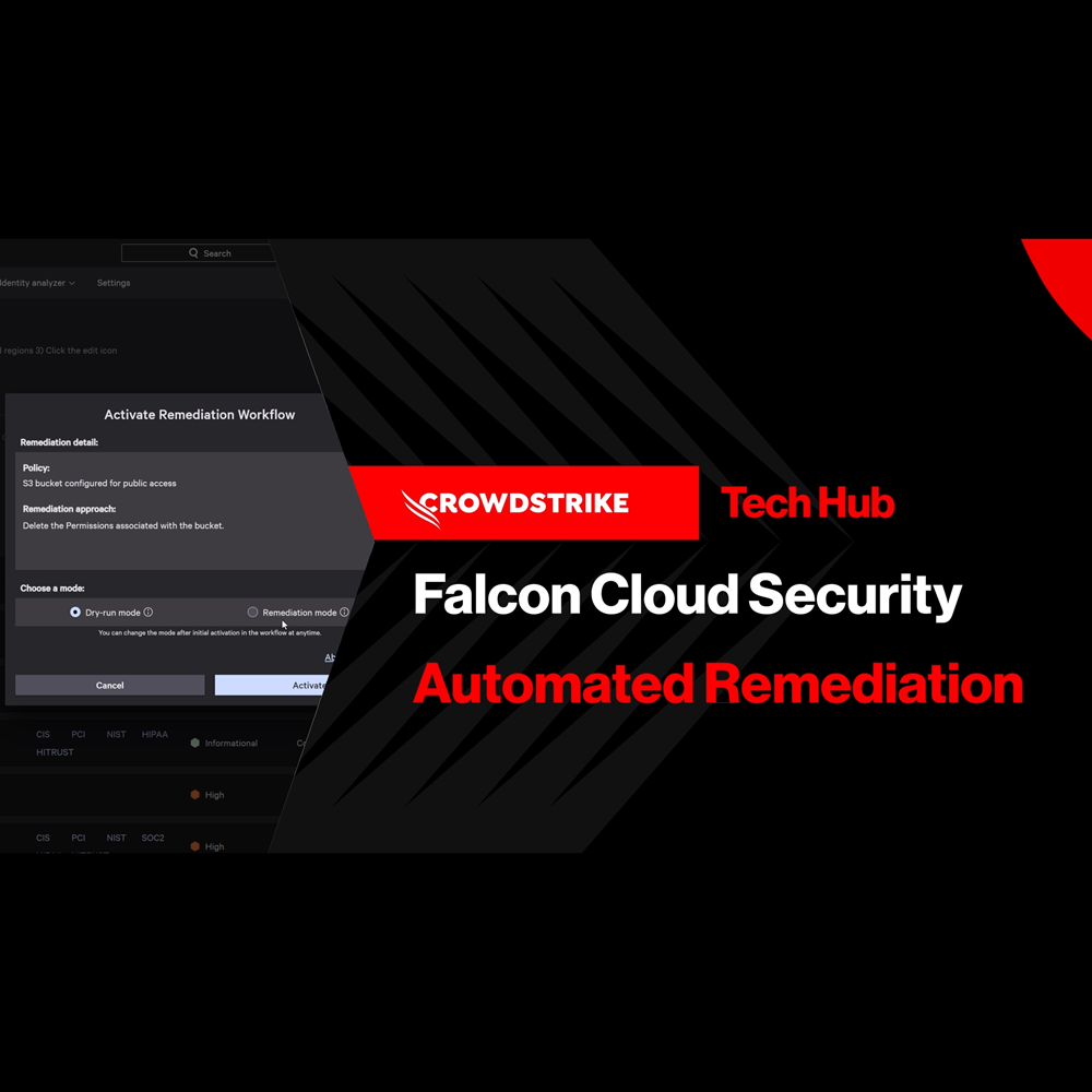
Cloud Security - Automated Remediation
Play Video
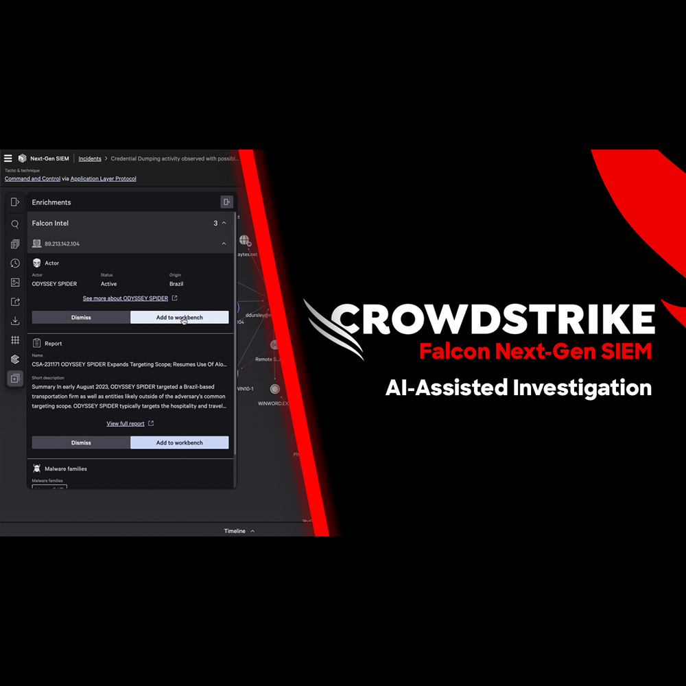
NG-SIEM - AI Assisted Investigation
Play Video
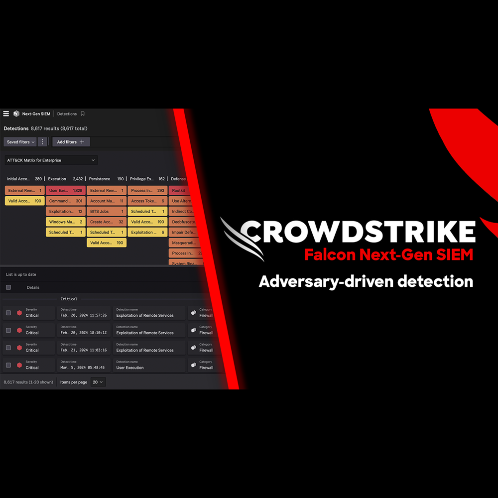
NG-SIEM - Adversary Driven Detection
Play Video
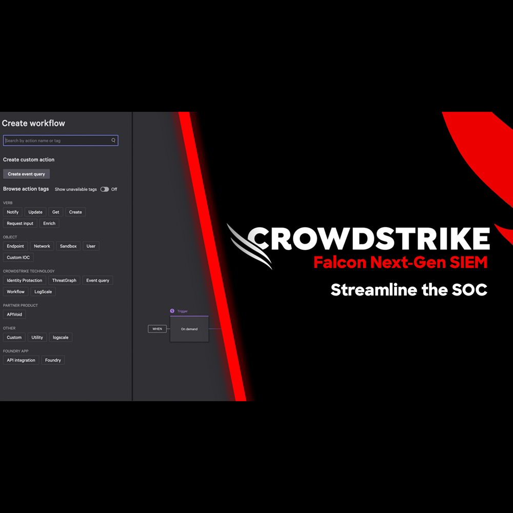
NG-SIEM - Streamline The SOC
Play Video
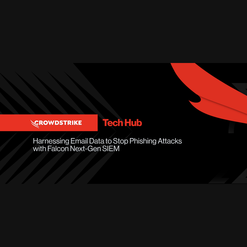
NG-SIEM - Harnessing Email Data to Stop Phishing Attacks
Play Video
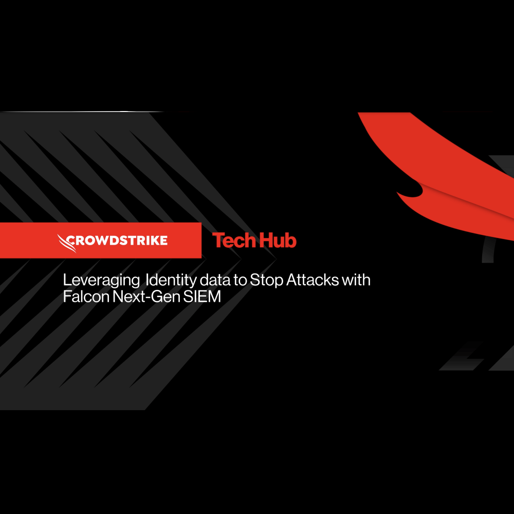
NG-SIEM - Leveraging Identity Data to Stop Attacks
Play Video
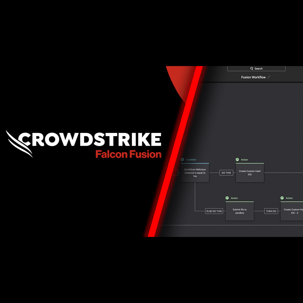
Falcon Fusion SOAR
Play Video
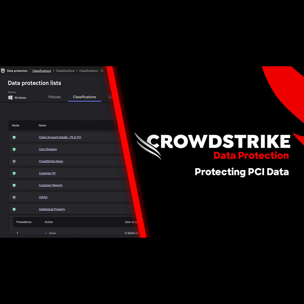
Data Protection - Protecting PCI Data
Play Video
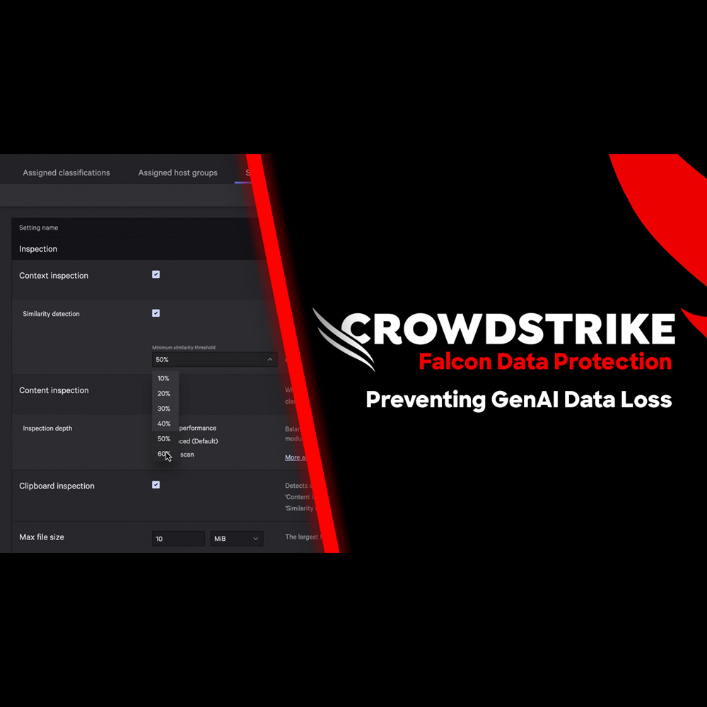
Data Protection - Preventing GenAI Data Loss
Play Video
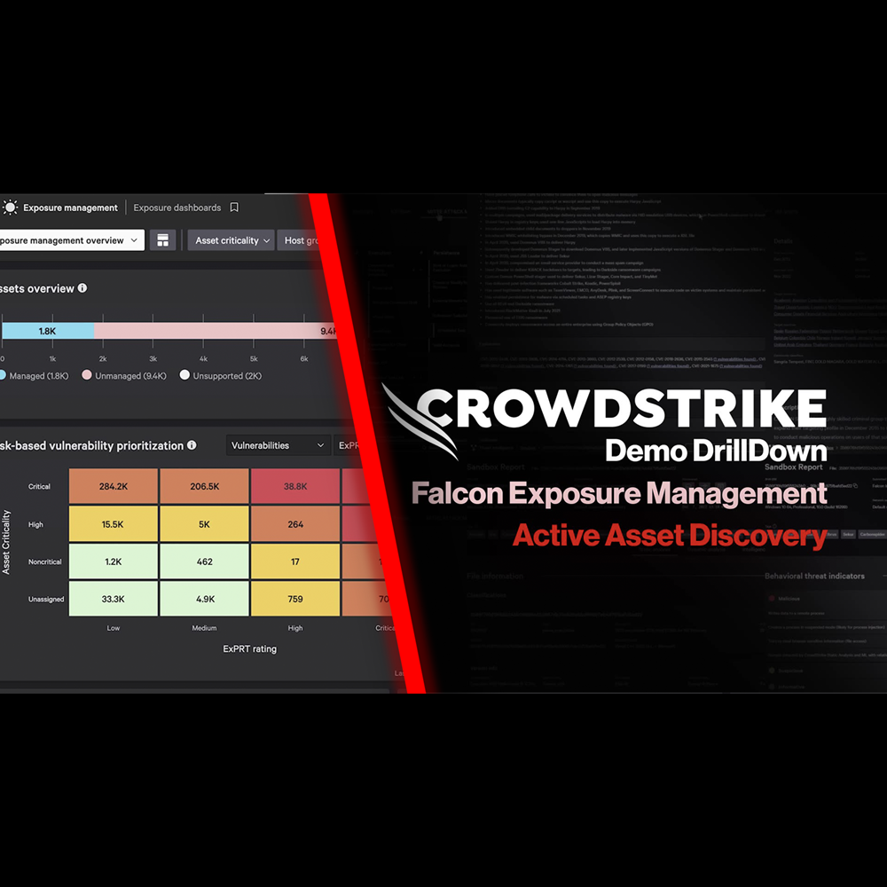
Exposure Management - Active Asset Scanning
Play Video
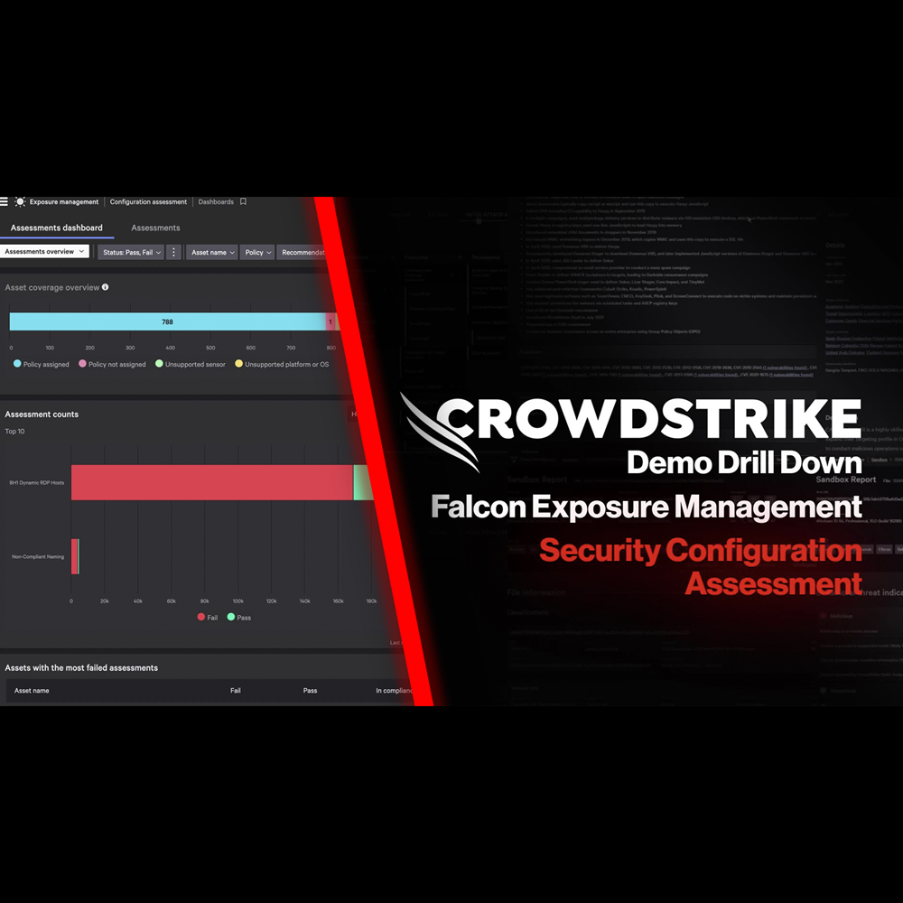
Exposure Management - Security Configuration Assessment
Play Video
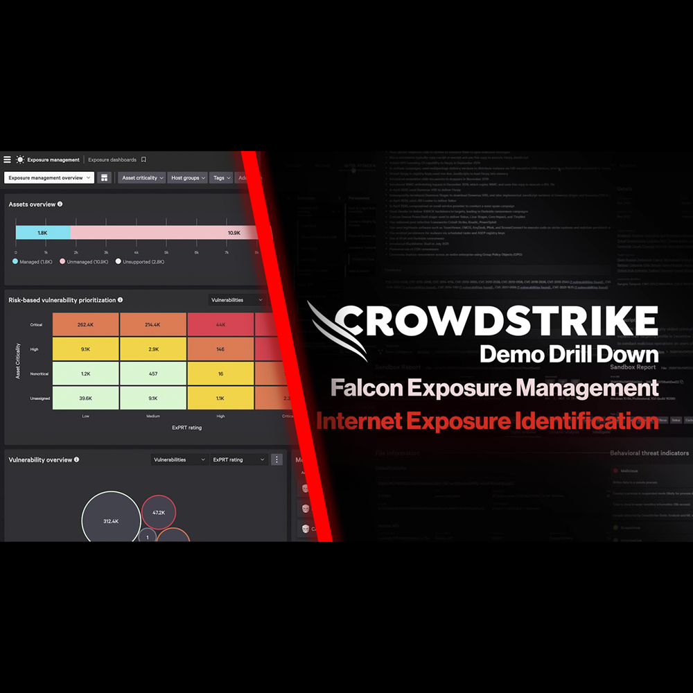
Exposure Management - Internet Exposure Identification
Play Video
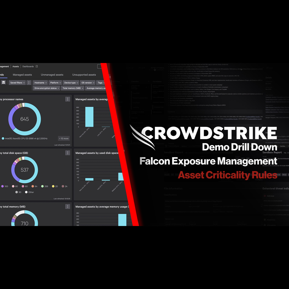
Exposure Management - Asset Criticality Rules
Play Video
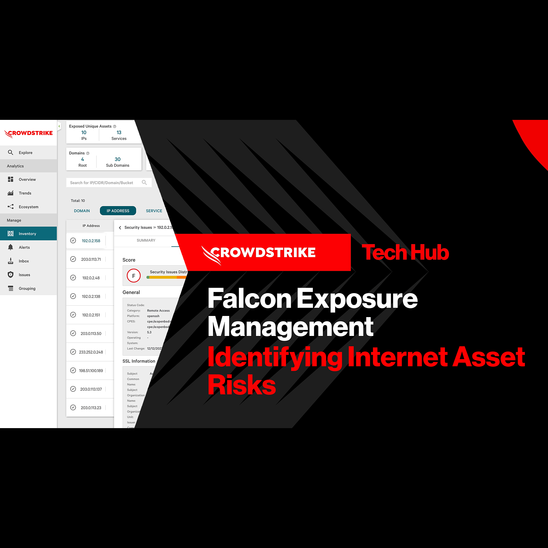
Exposure Management - Identifying Internet Asset Risks
Play Video
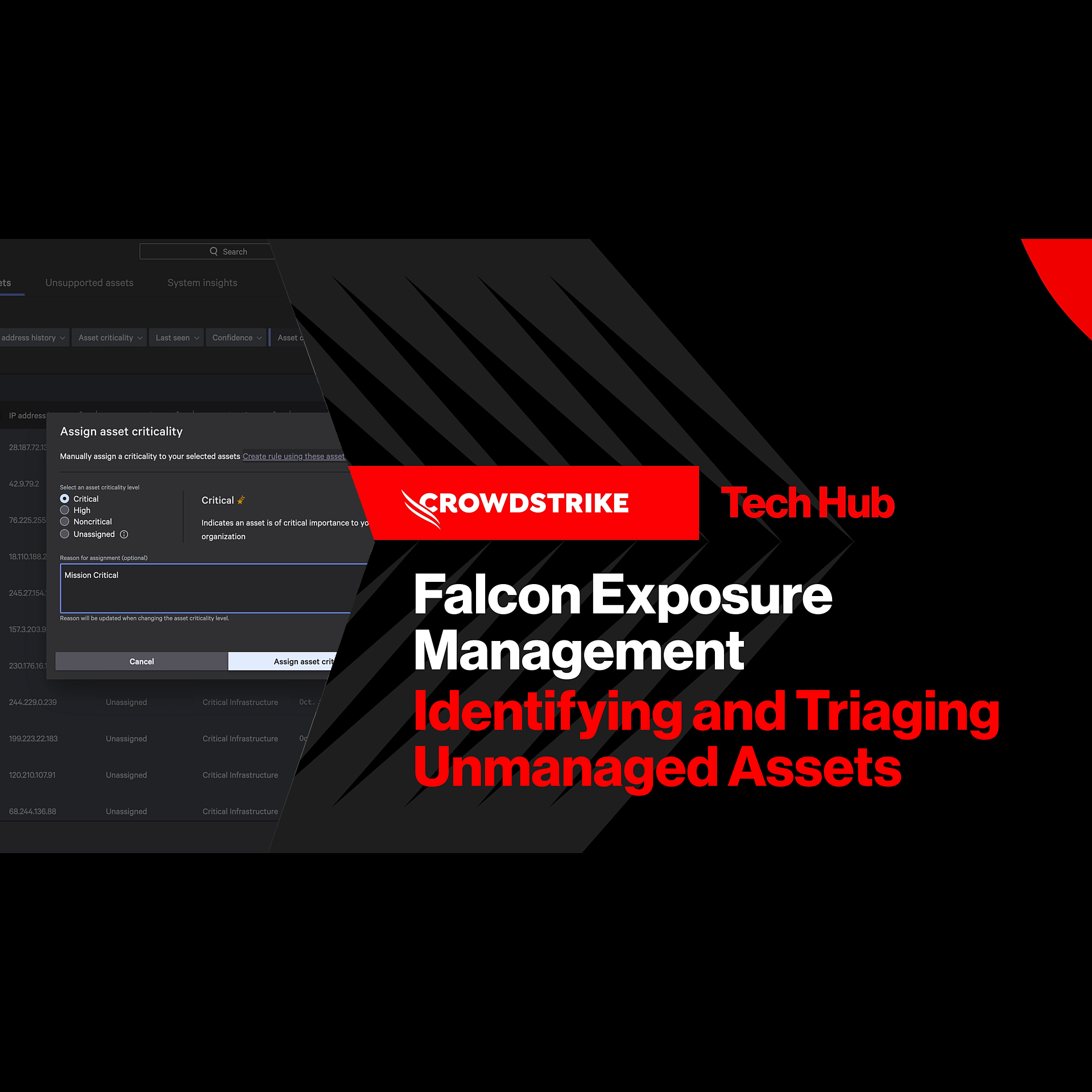
Exposure Management - Identifying and Triaging Unmanaged Assets
Play Video
Falcon for IT - Get Instant Answers
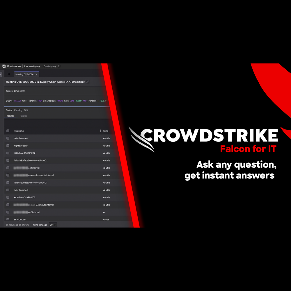
Play Video
Adversary Intelligence - Premium
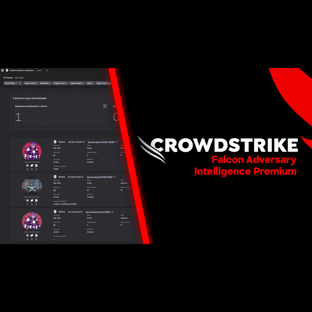
Play Video
Adversary OverWatch - Identity Credential Monitoring
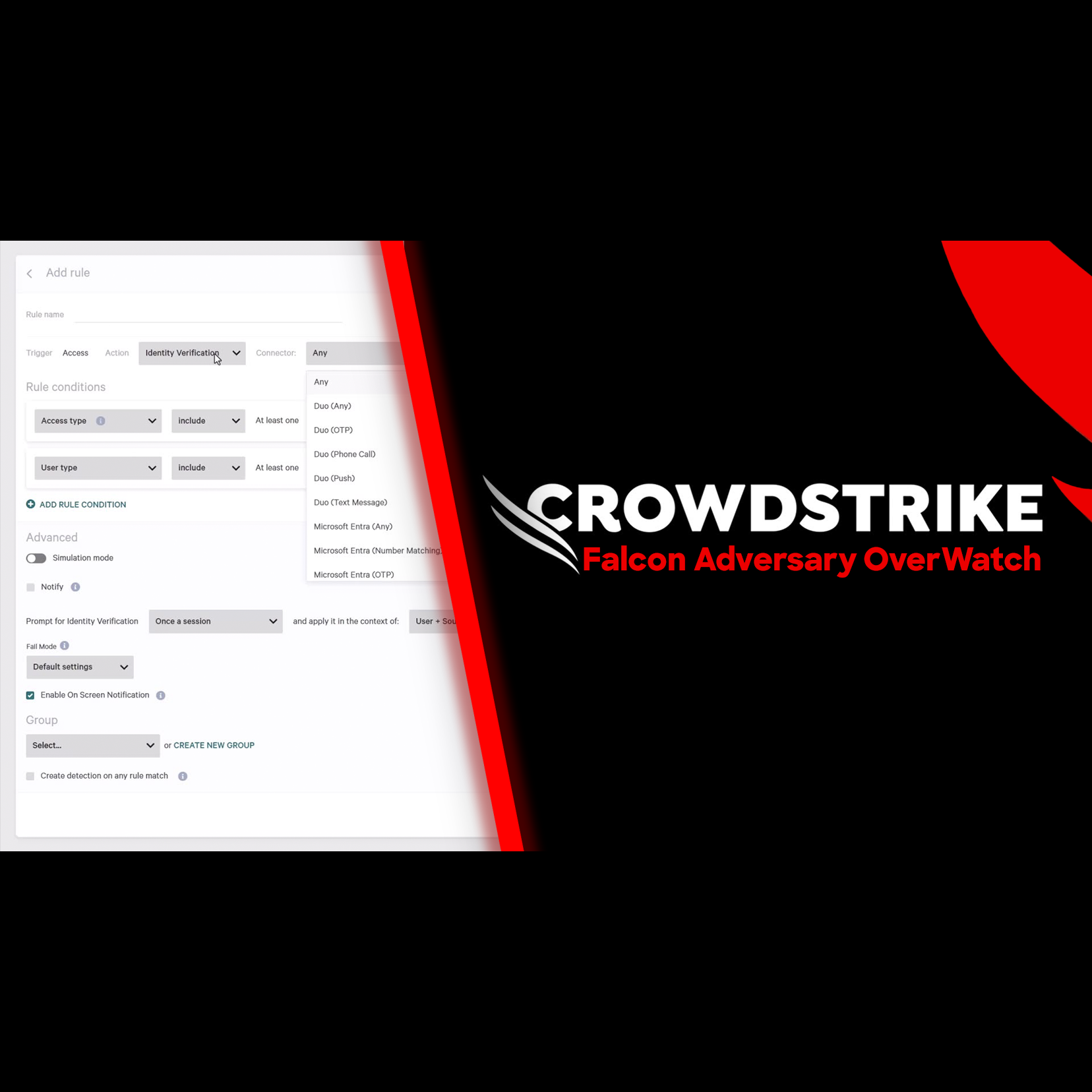
Play Video
Adversary Intelligence
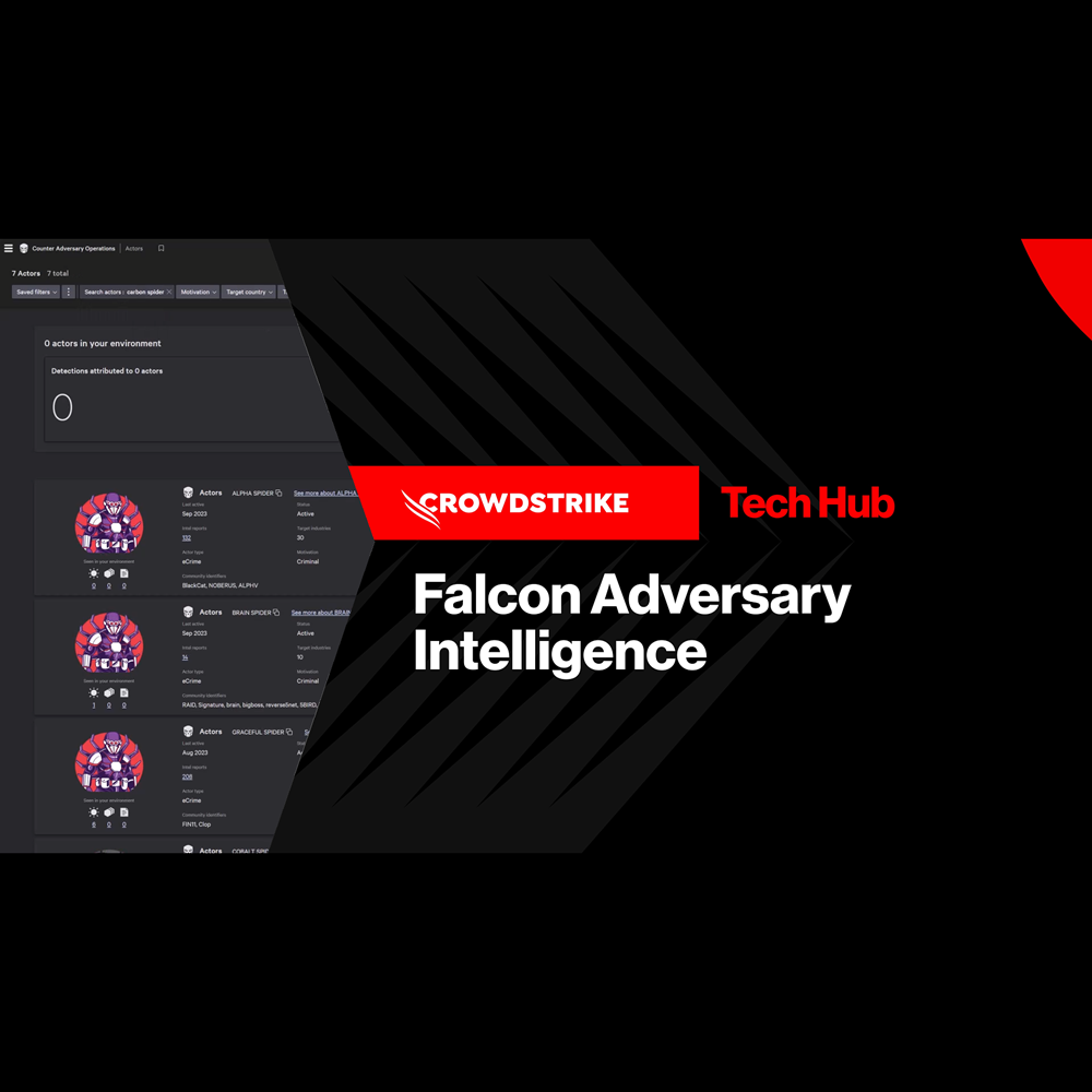
Play Video
Adversary Intelligence - Exposed Credentials
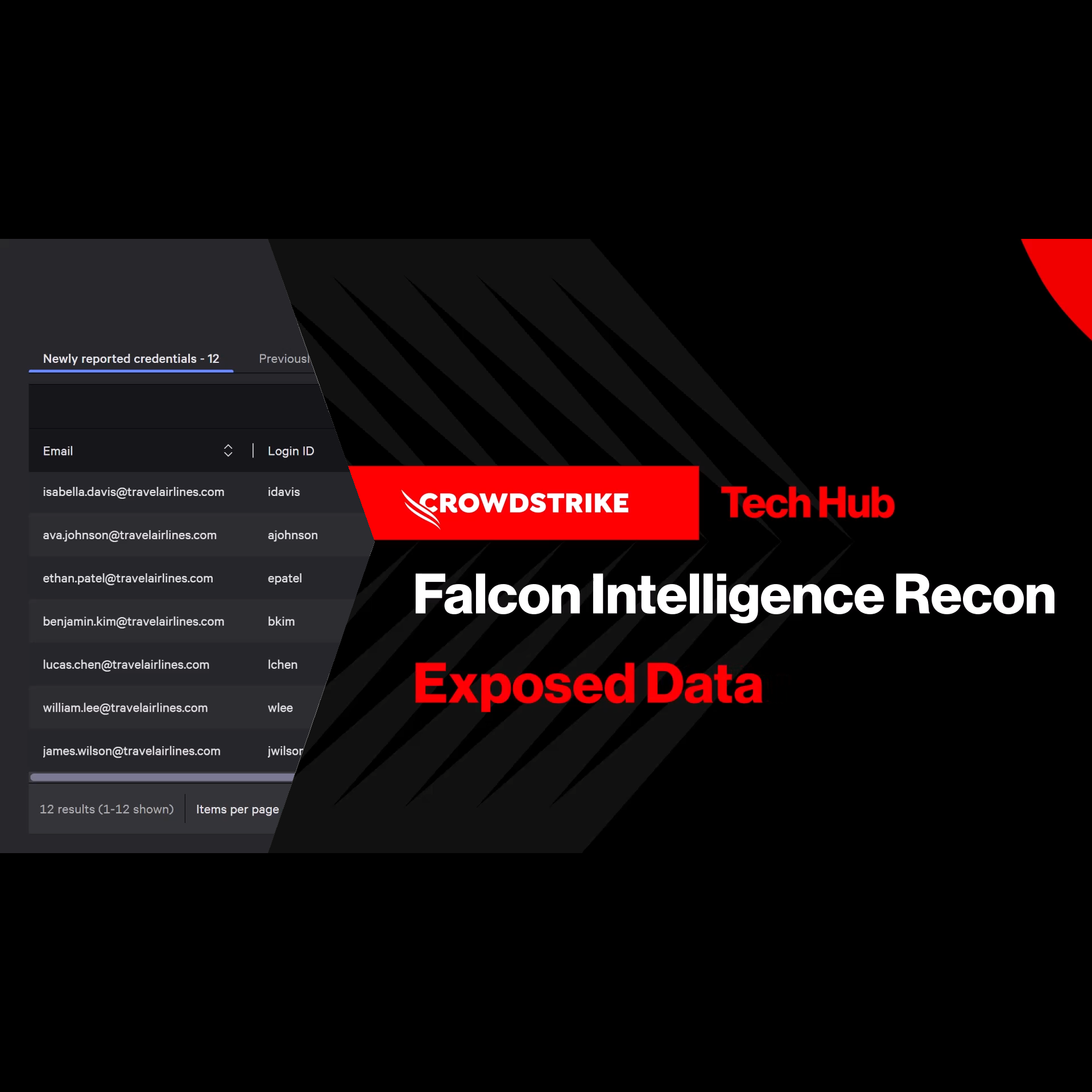
Play Video
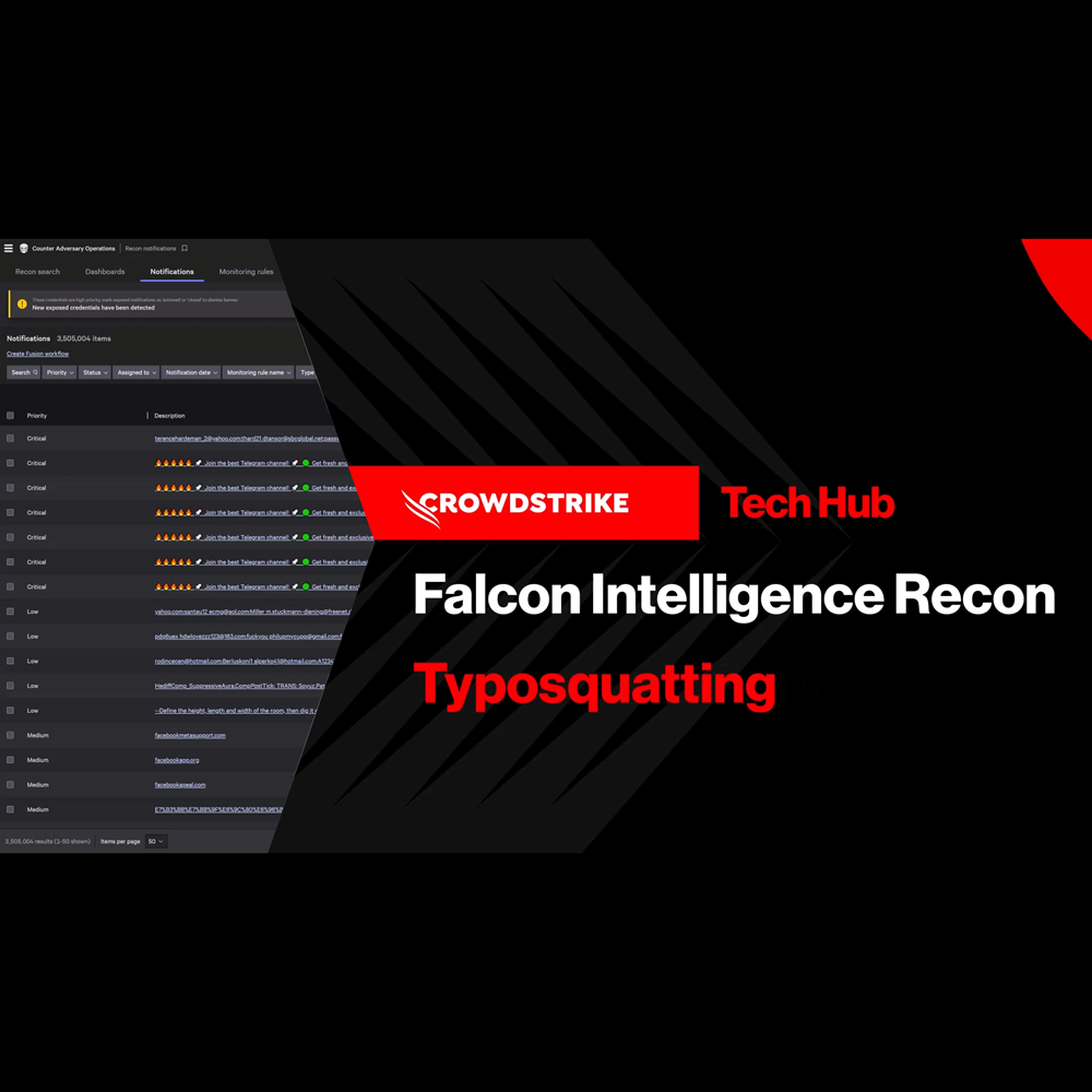
Adversary Intelligence - Typosquatting
Play Video
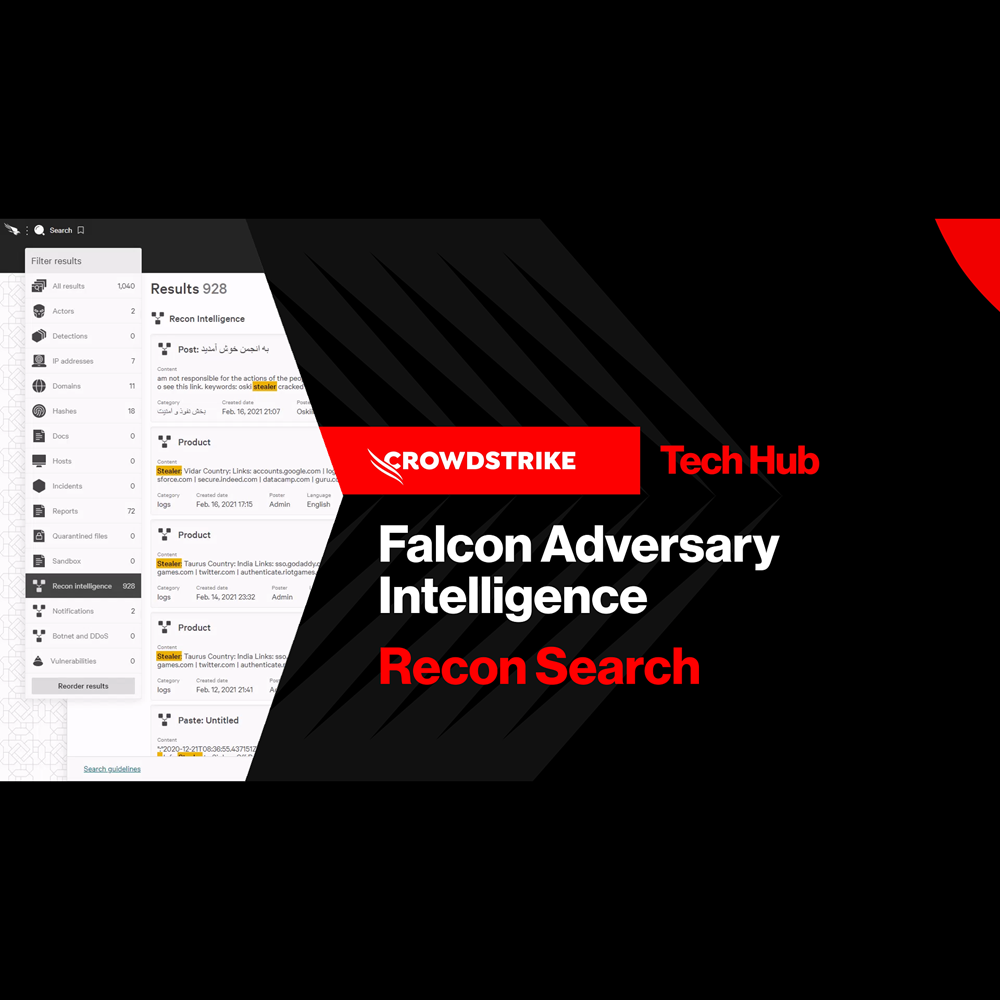
Adversary Intelligence - Recon Search
Play Video
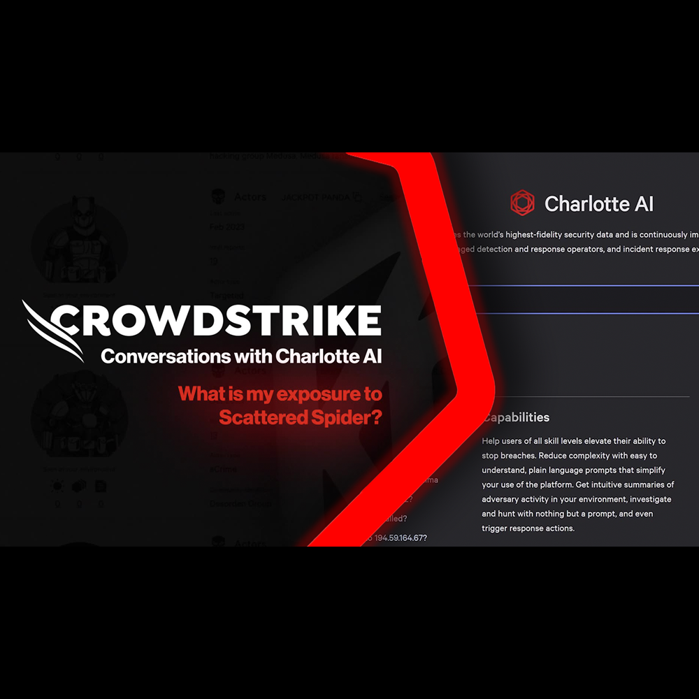
Conversations with Charlotte AI: Scattered Spider
Play Video
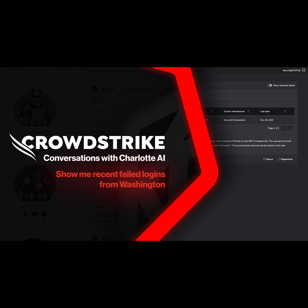
Conversations with Charlotte AI: Failed Login Attempts
Play Video
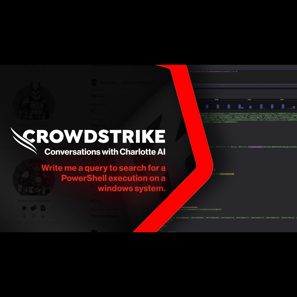
Conversations with Charlotte AI: Writing Search Queries
Play Video
Conversations with Charlotte AI: Credential Exposure on Win10 Hosts

Play Video
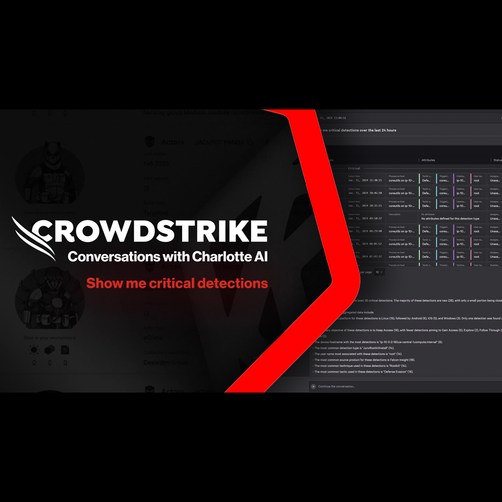
Conversations with Charlotte AI: Rapid Assessment of Critical Detections
Play Video
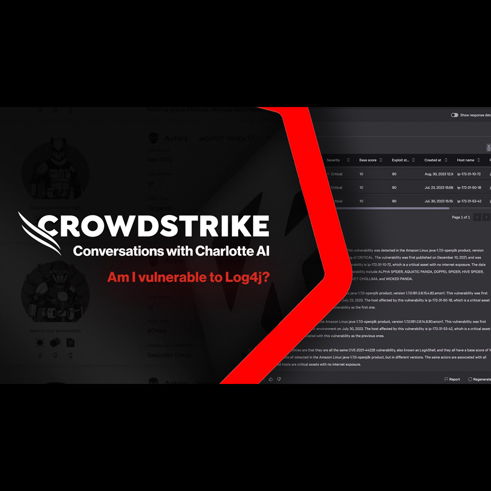
Conversations with Charlotte AI: Assessing Potential Attacks
Play Video
Want to learn even more?
View all content