Endpoint Security
Your ultimate resource for the CrowdStrike Falcon® platform: In-depth videos, tutorials, and training.
Select a product category below to get started.
Endpoint Security
Self-paced Interactive Demo
Falcon Encounter Hands-On Labs
Falcon Next-Gen Identity Security
in Action
Self-paced Interactive Demo
Falcon Encounter Hands-On Labs
Falcon Cloud Security
Self-paced Interactive Demo
Falcon Encounter Hands-On Labs
Next-Gen SIEM Demo Video
Interactive Next-Gen SIEM Demo
Falcon Encounter Hands-On Labs
Falcon Data Security
Self-paced Interactive Demo
Falcon Encounter Hands-On Labs
Falcon Exposure Management
Self-paced Interactive Demo
Falcon Encounter Hands-On Labs
Falcon for IT
Self-paced Interactive Demo
Falcon Encounter Hands-On Labs
CrowdStrike Counter Adversary Operations
Self-Paced Interactive Demo
Falcon Encounter Hands-On Labs
Charlotte AI
Conversations with Charlotte AI: Malware Families
Falcon Encounter Hands-On Labs
Blog - AI Innovations to Expedite Security Operations and Upgrade the Analyst Experience
Video - Securing Non-Human Identities Against Modern Threats
Video - Next Gen Identity Security: Secure every identity, human, non-human, and AI agents, everywhere
Video - Stop Adversaries before they Login with Falcon ID
Blog - Innovations in Falcon Cloud Security at Fal.Con 2024
Tech Blog - Outpace the Adversary: CrowdStrike’s AI-native Falcon Platform in Action
Demo Showcase - Stopping CURLY SPIDER with Falcon Next-Gen SIEM
Blog - Detecting Microsoft Entra ID Primary Refresh Token Abuse with Falcon Next-Gen SIEM
Tech Hub - Data Security - Preventing GenAI Data Loss
Tech Blog - Outpace the Adversary: CrowdStrike’s AI-native Falcon Platform in Action
Press Release - New CrowdStrike Falcon Platform Innovations Unify End-to-End Security and IT Operations
Demo - See Falcon for IT in Action
Demo - Falcon for IT Visibility + Response: Demo Drill Down
Proactive Security: Outpace the Adversary - CrowdStrike's AI-native Falcon Platform in Action - Featuring Falcon for IT
Blog - How CrowdStrike Hunts, Identifies and Defeats Cloud-Focused Threats
Blog - International Authorities Indict, Sanction Additional INDRIK SPIDER Members and Detail Ties to BITWISE SPIDER and Russian State Activity
Press Release - CrowdStrike Unleashes New Agentic, Outcome-Driven AI Innovations to Power the Next Evolution of the SOC
Blog - CrowdStrike Launches Agentic AI Innovations to Fortify the AI-Native SOC
Endpoint Security - Real Time Response
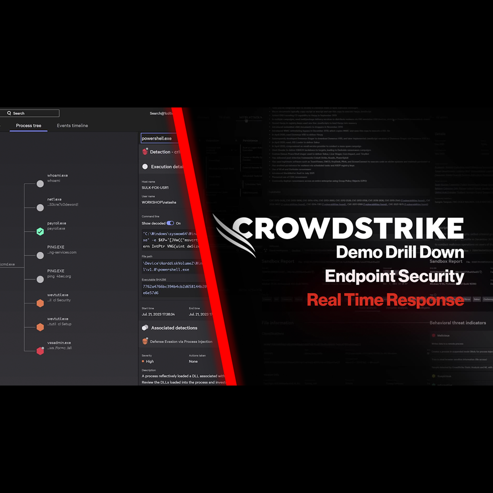
Play Video
Endpoint Security - Automated Remediation
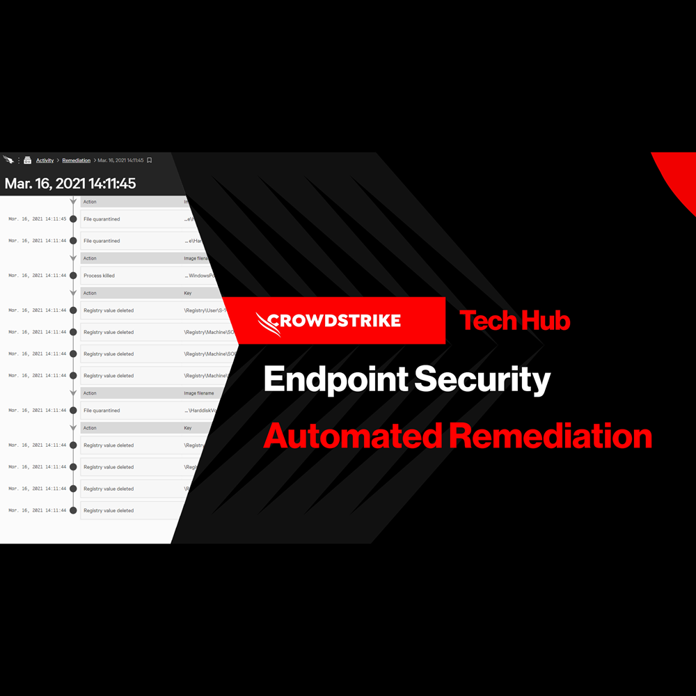
Play Video
Endpoint Security - Falcon Fusion with Real Time Response
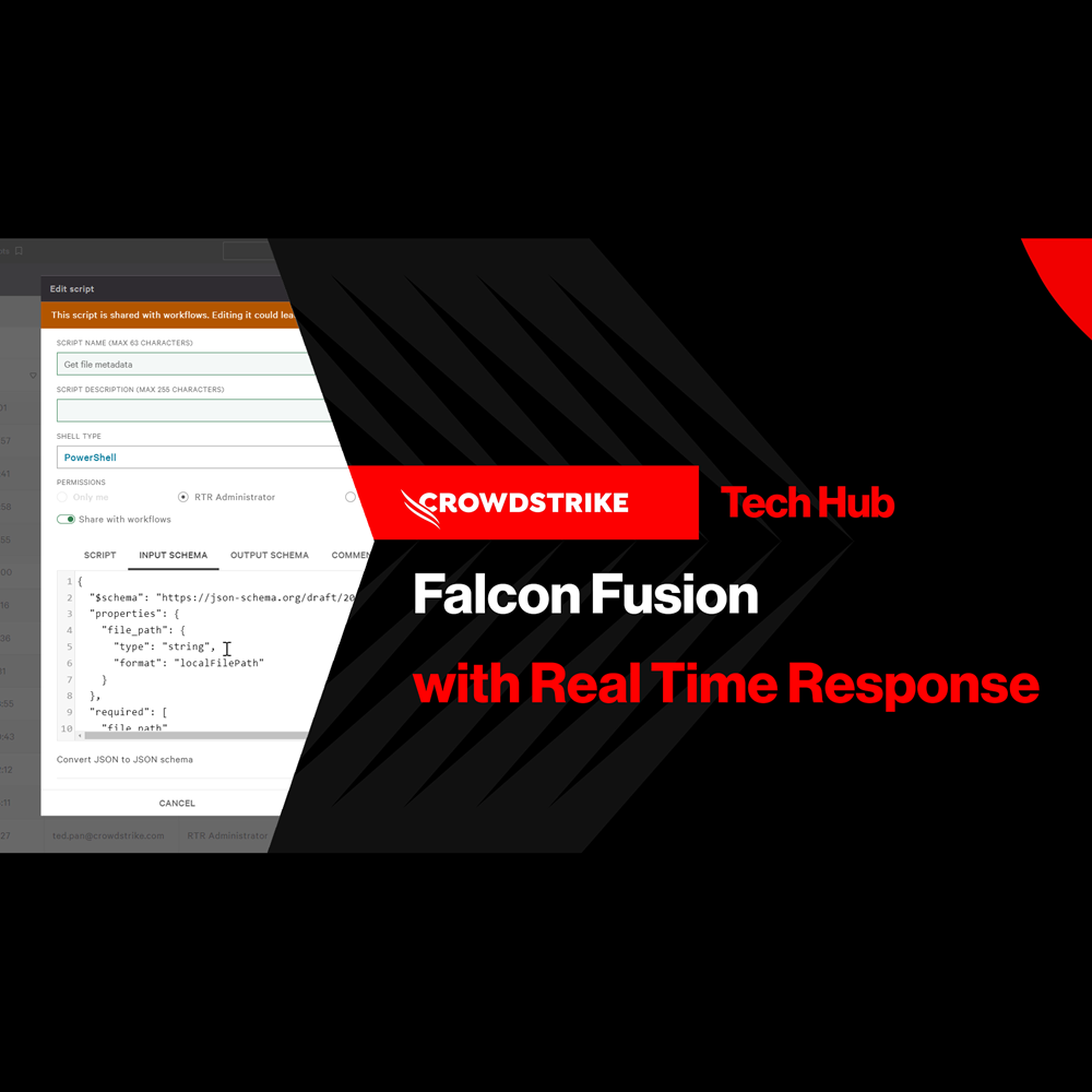
Play Video
Endpoint Security - Customized Dashboards
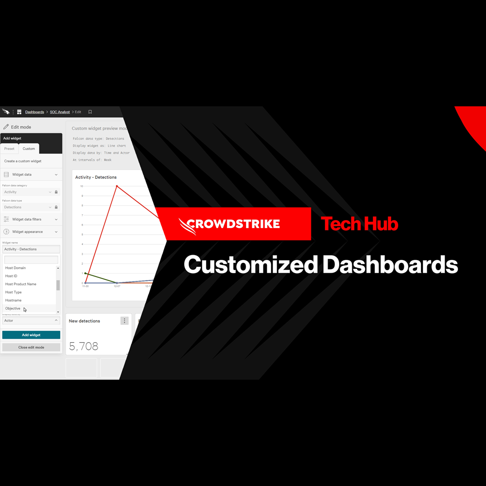
Play Video
Endpoint Security - Context Enrichment
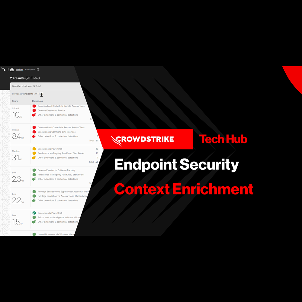
Play Video
Endpoint Security - Falcon Go for Small and Medium Businesses
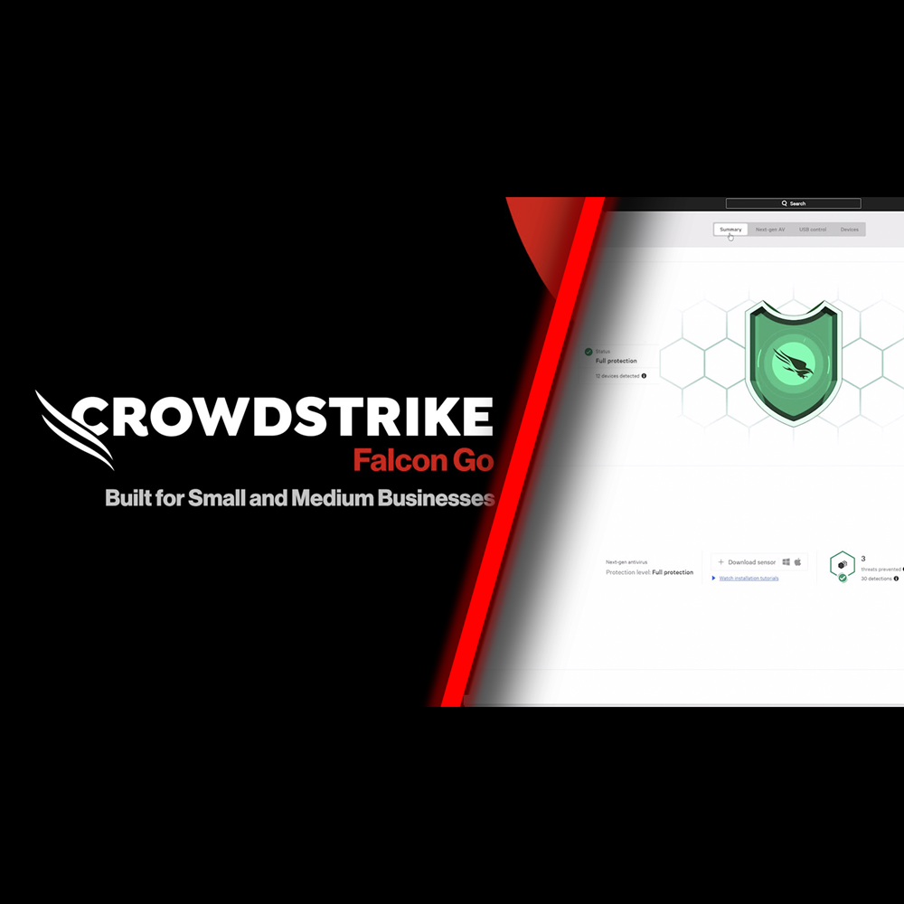
Play Video
Identity Protection - Protect Against Exposed Credentials
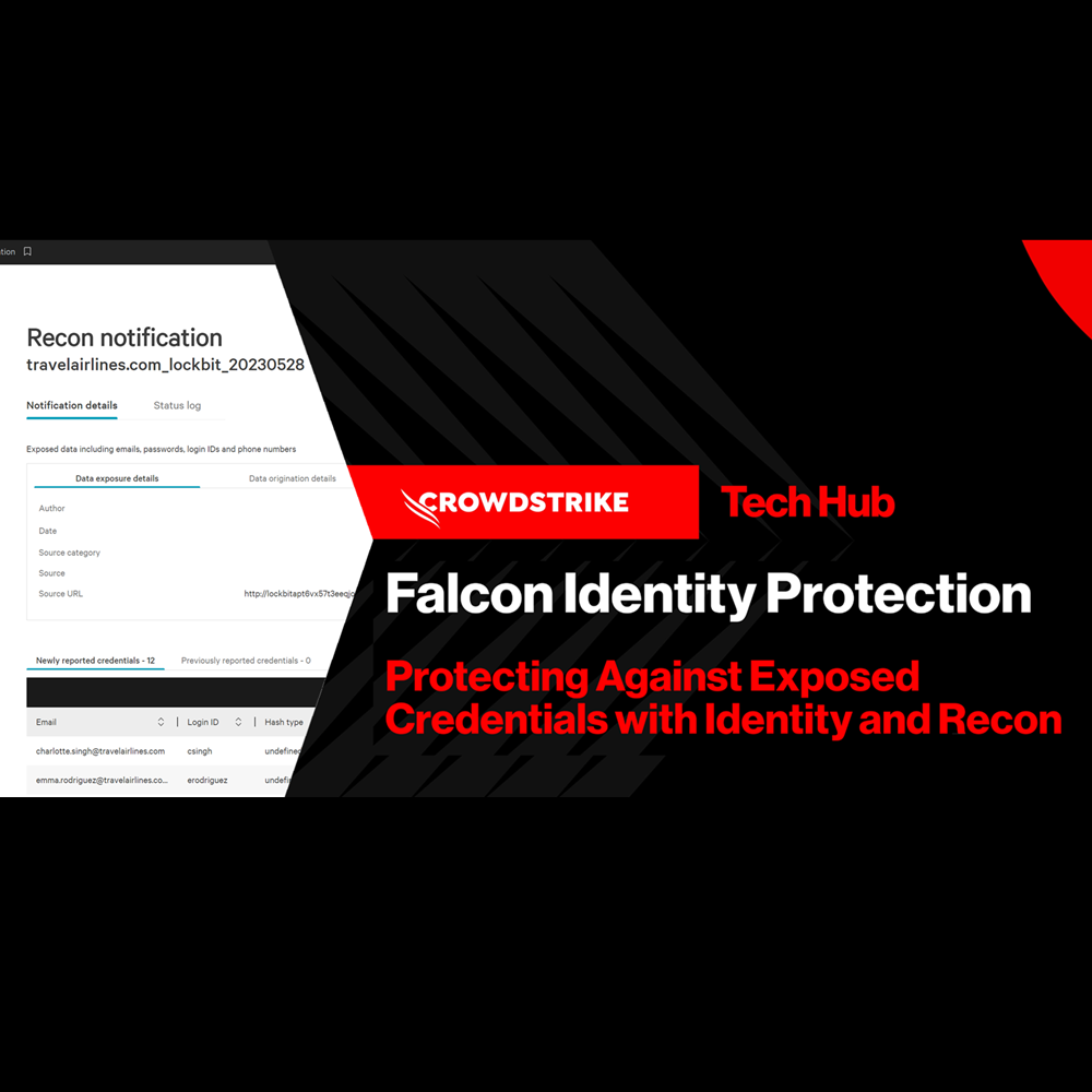
Play Video
Falcon Next-Gen Identity Security In Action
Play Video
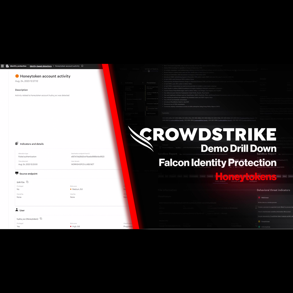
Identity Protection - Honeytoken
Play Video
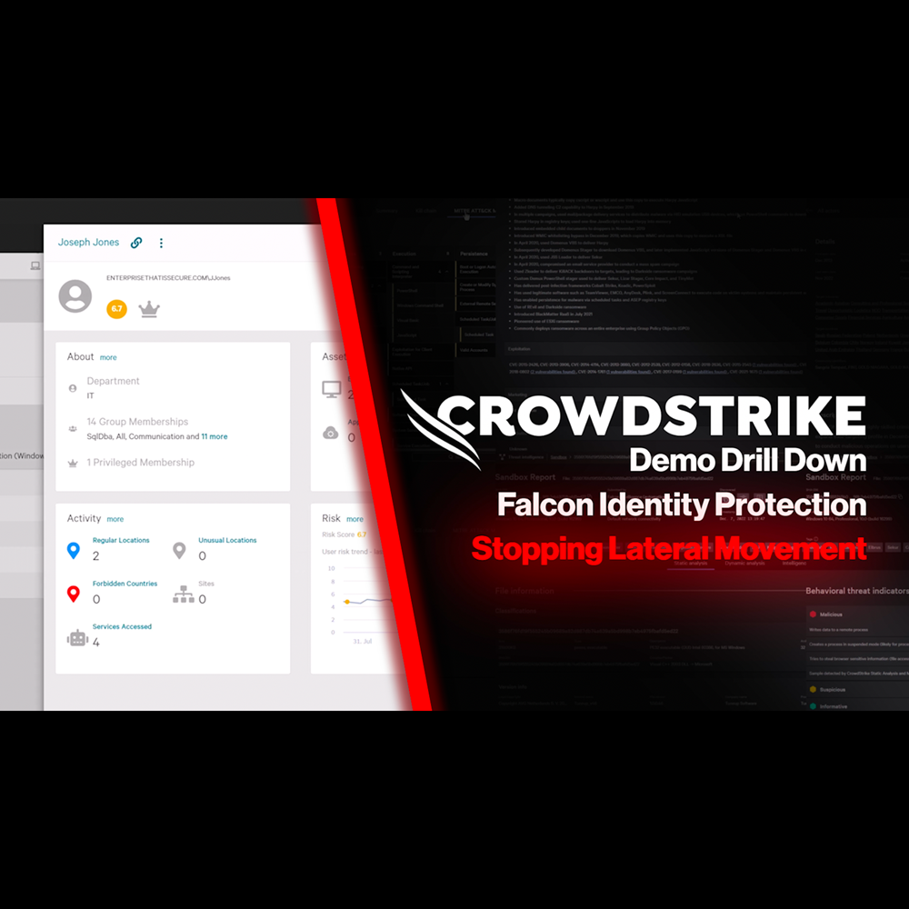
Identity Protection - Stop Lateral Movement
Play Video
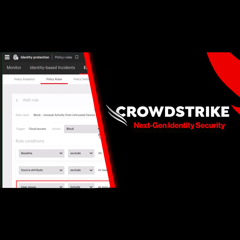
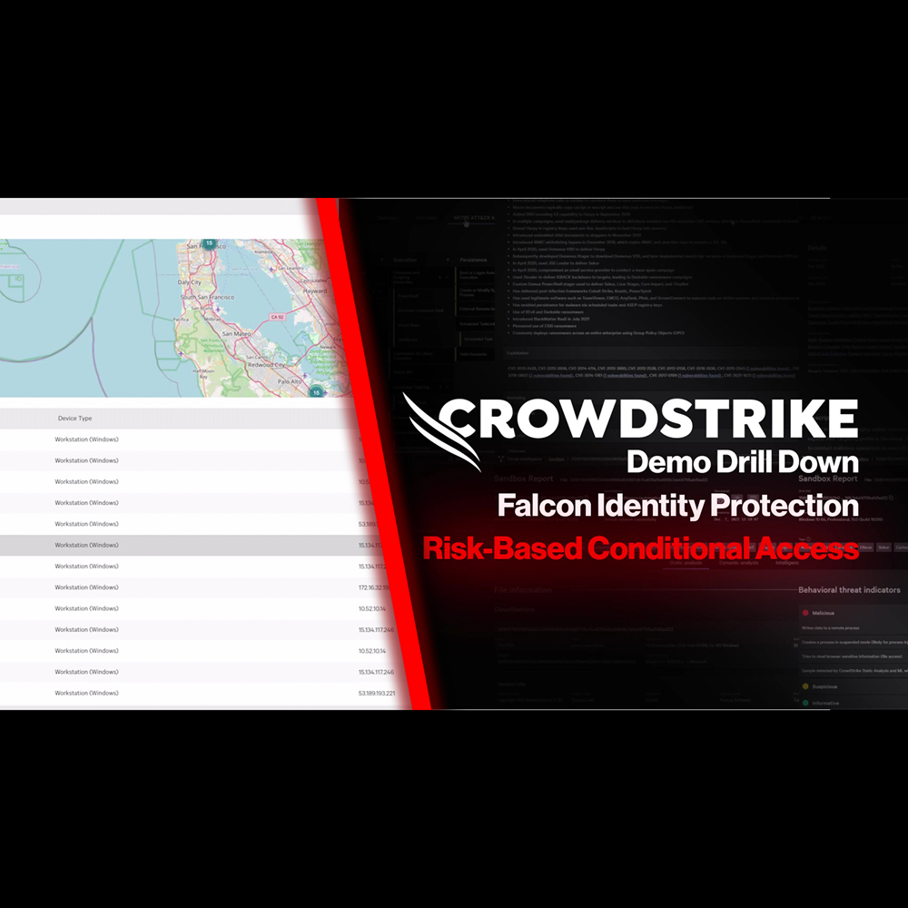
Identity Protection - Risk-Based Conditional Access
Play Video
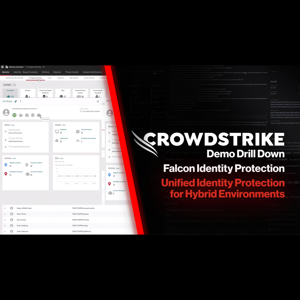
Identity Protection - Protection for Hybrid Environments
Play Video
Cloud Security - Securing AI Innovations with NVIDIA
Play Video
Cloud Security - How the Cloud Reshapes Your Attack Surface
Play Video
Cloud Security - How to Detect Malicious Intent in the Cloud
Play Video
Cloud Security - Built for Speed: Real-Time Cloud Threat Detection
Play Video
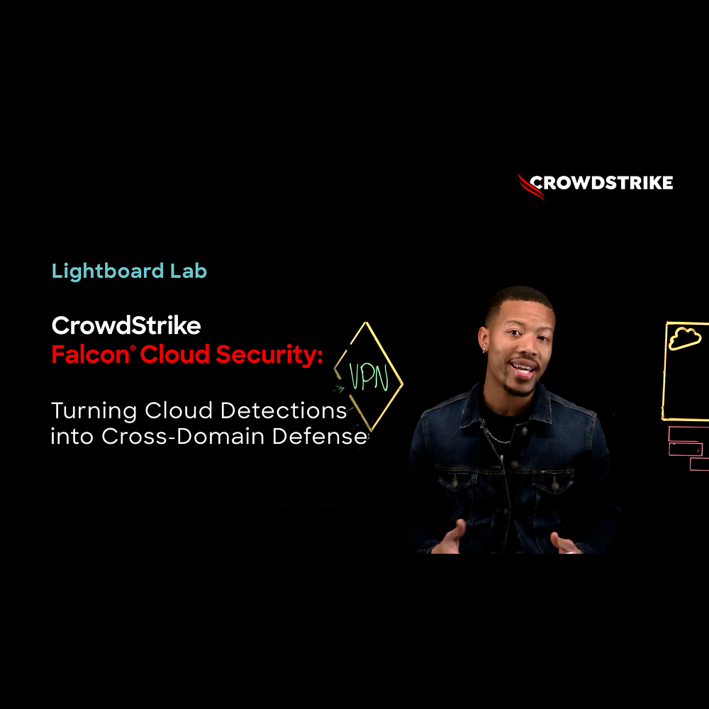
Cloud Security - Turning Cloud Detections into Cross-Domain Defense
Play Video
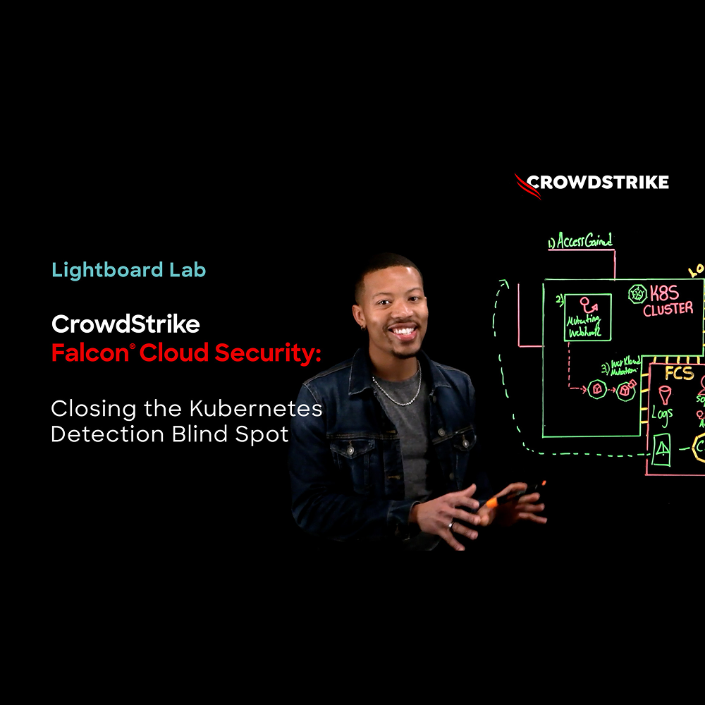
Cloud Security - Closing the Kubernetes Detection Blind Spot
Play Video
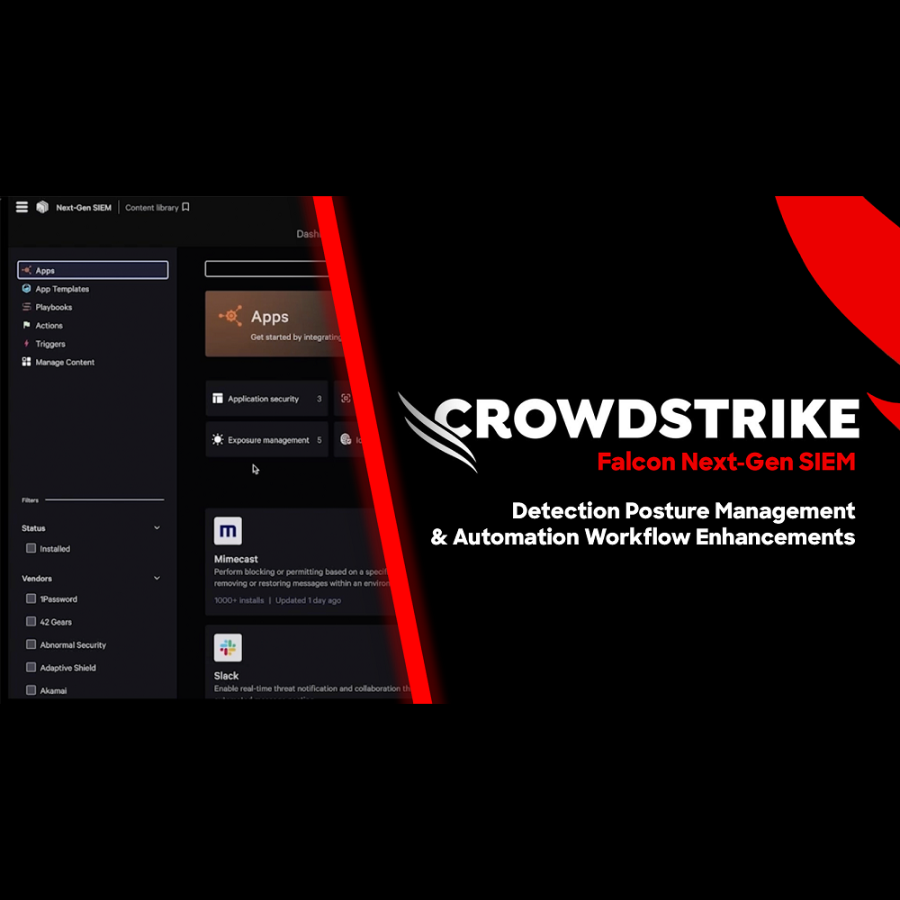
NG-SIEM - Detection Posture Management
Play Video
NG-SIEM - Dynamic Lookup Tables with Falcon Fusion SOAR

Play Video
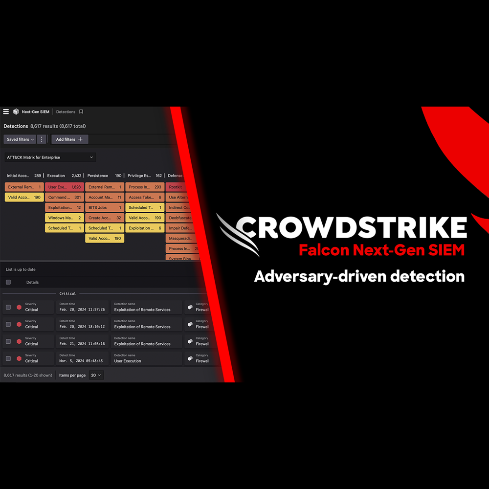
NG-SIEM - Adversary Driven Detection
Play Video
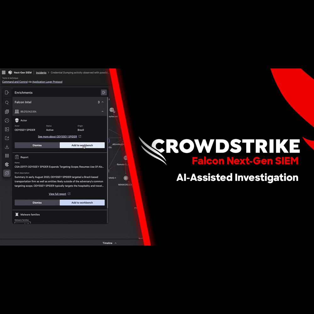
NG-SIEM - AI Assisted Investigation
Play Video
NG-SIEM - Harnessing Email Data to Stop Phishing Attacks
Play Video
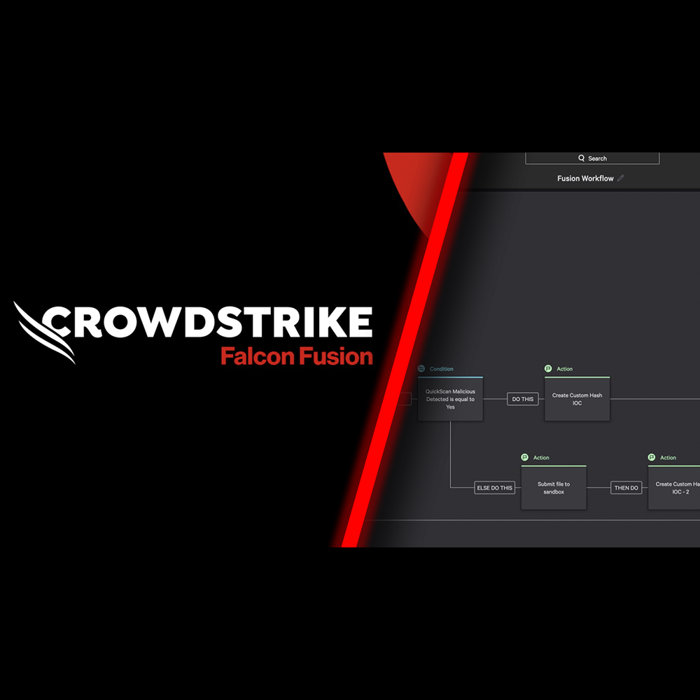
Falcon Fusion SOAR
Play Video
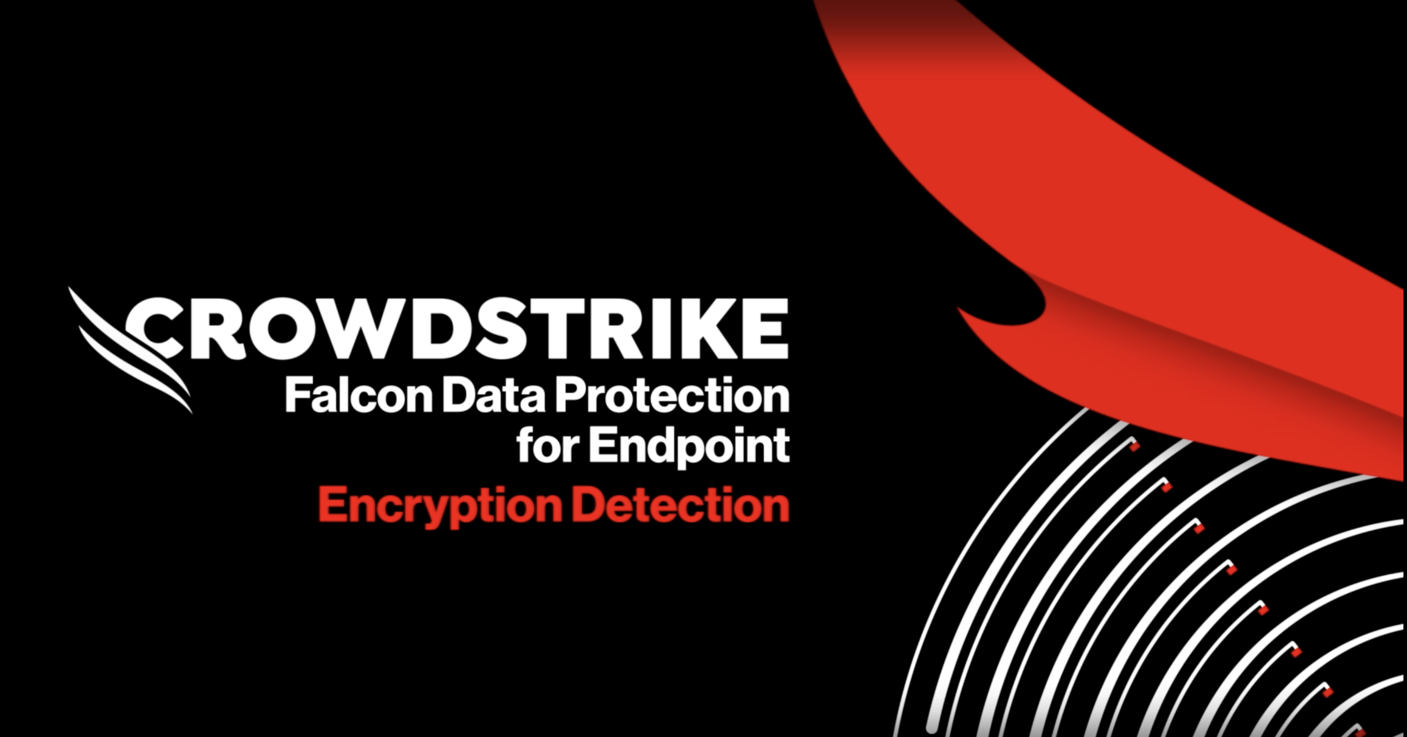
Falcon Data Security for Endpoint: Encryption Detection
Play Video
Falcon Data Security for Cloud
Play Video
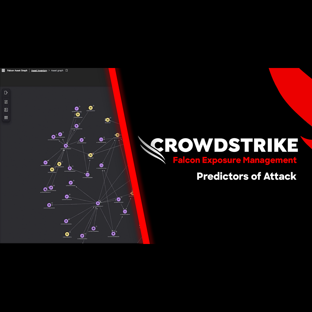
Exposure Management - Predictors of Attack
Play Video
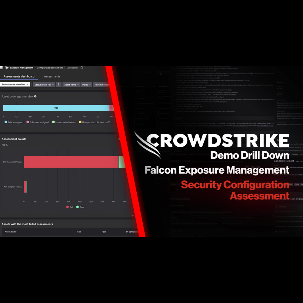
Exposure Management - Security Configuration Assessment
Play Video
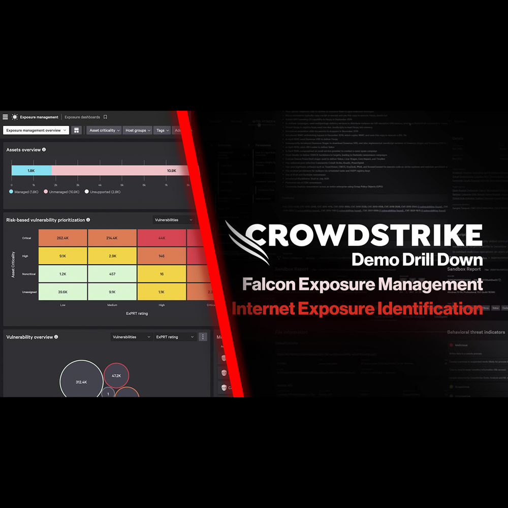
Exposure Management - Internet Exposure Identification
Play Video
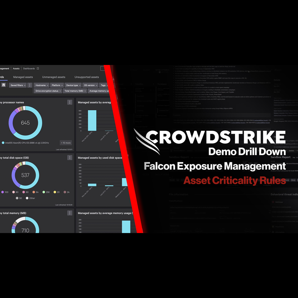
Exposure Management - Asset Criticality Rules
Play Video
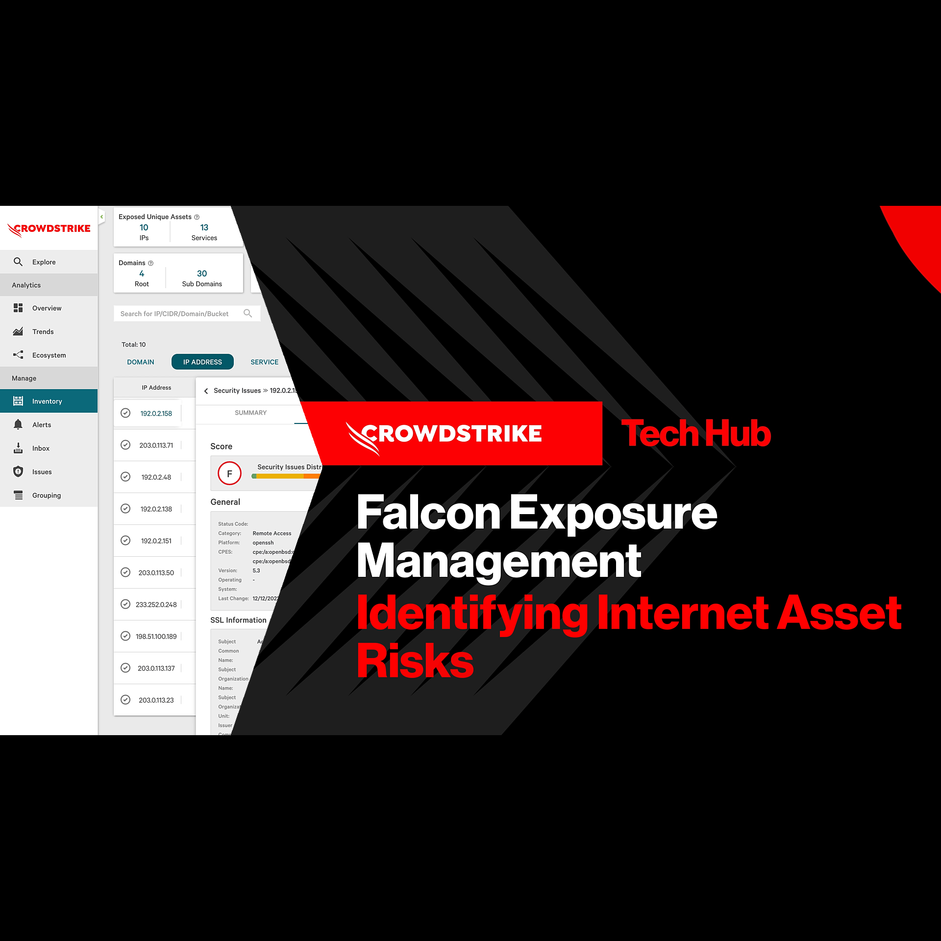
Exposure Management - Identifying Internet Asset Risks
Play Video
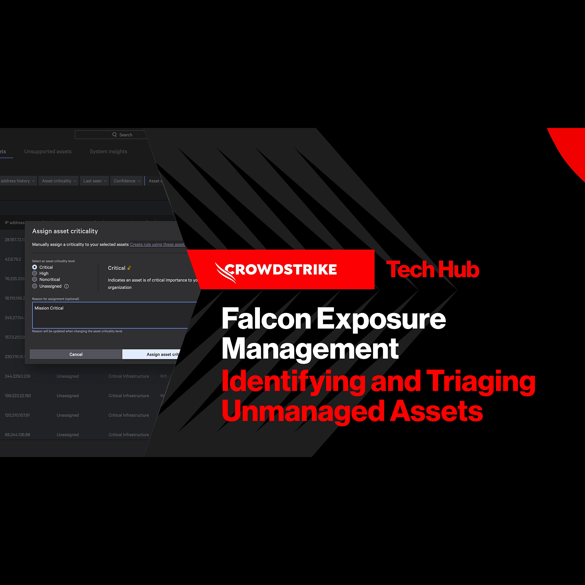
Exposure Management - Identifying and Triaging Unmanaged Assets
Play Video
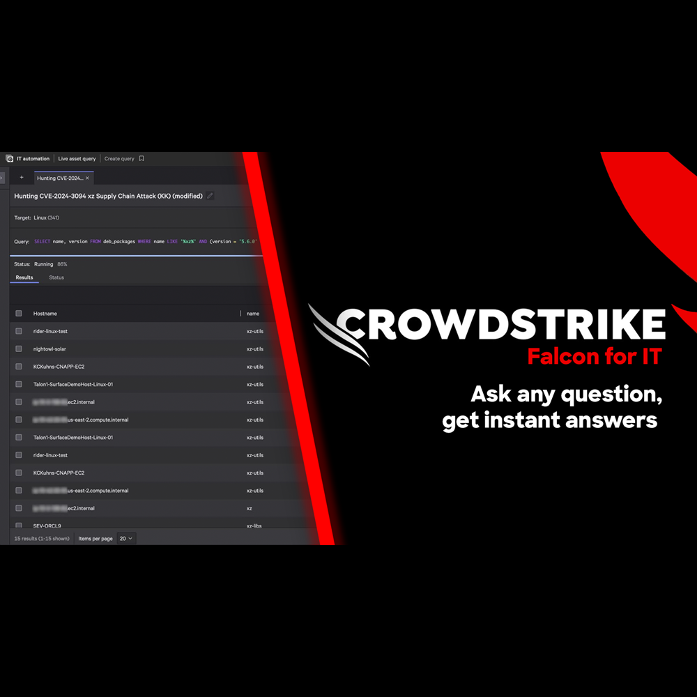
Falcon for IT - Get Instant Answers
Play Video
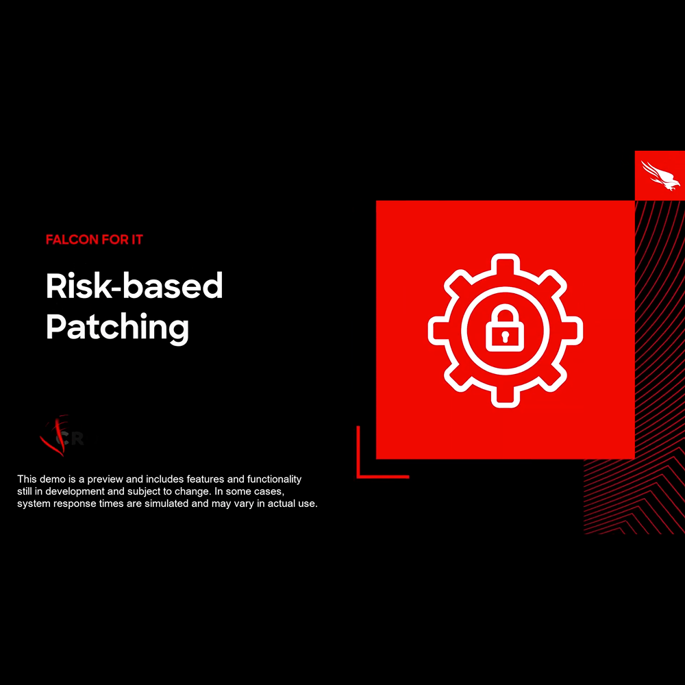
Falcon for IT - Risk-based Patching
Play Video
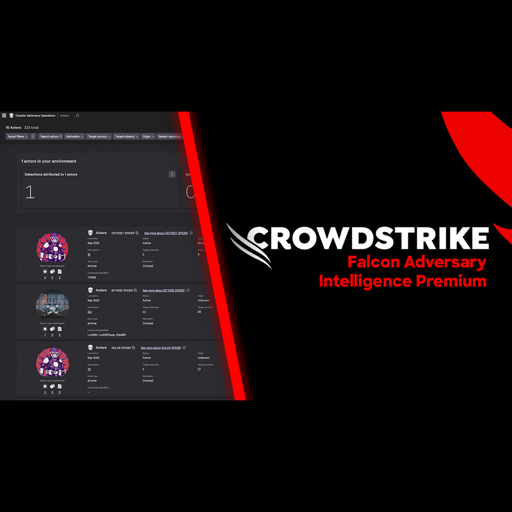
Adversary Intelligence - Premium
Play Video
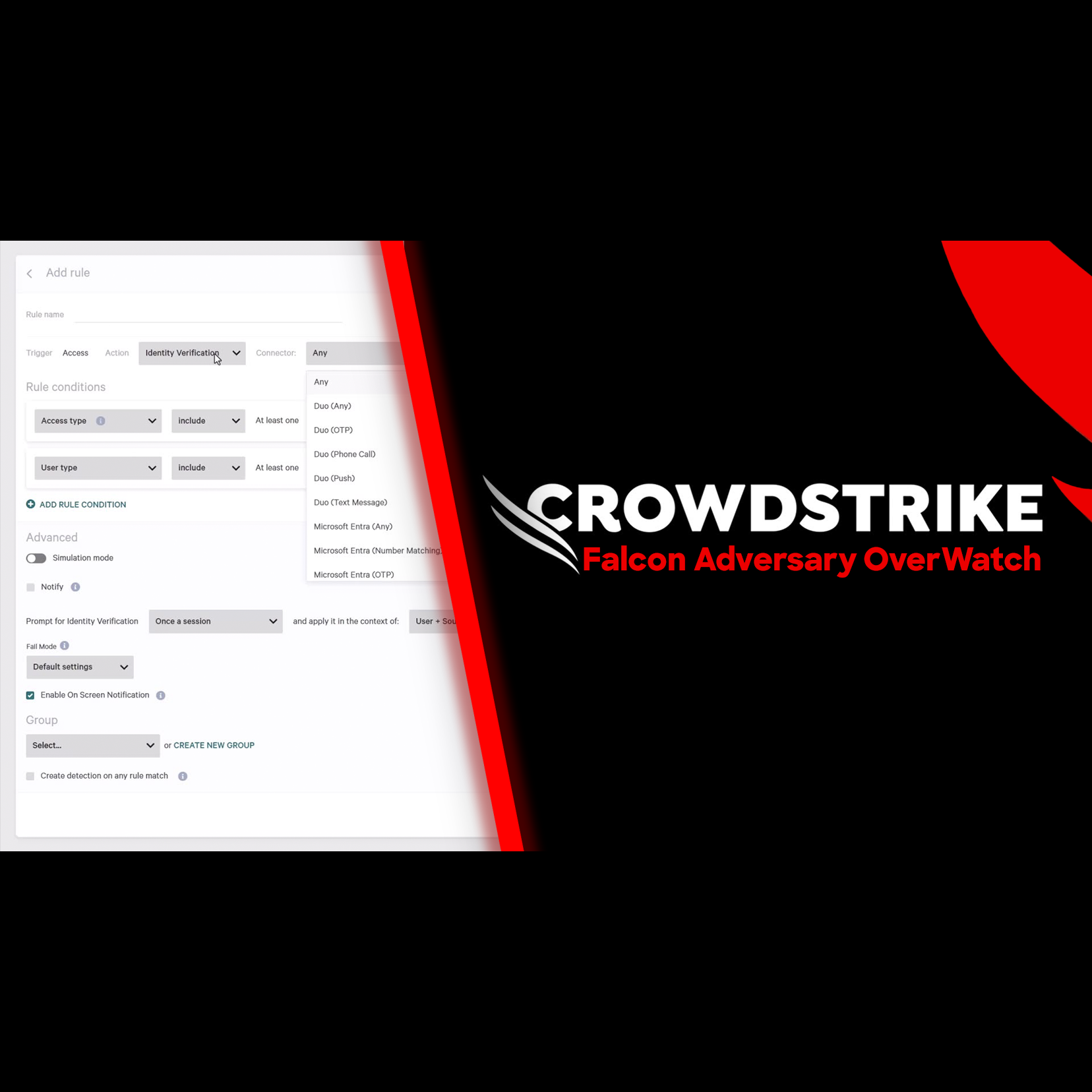
Adversary OverWatch - Identity Credential Monitoring
Play Video
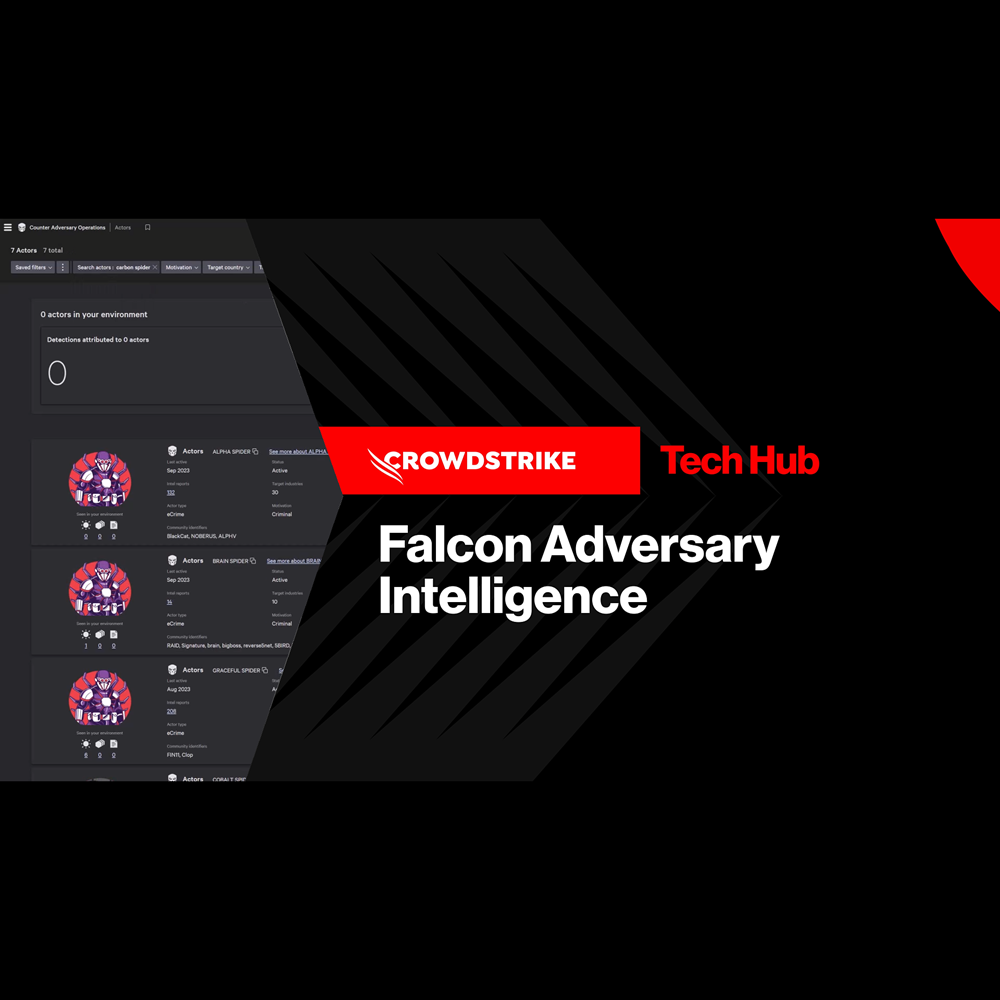
Adversary Intelligence
Play Video
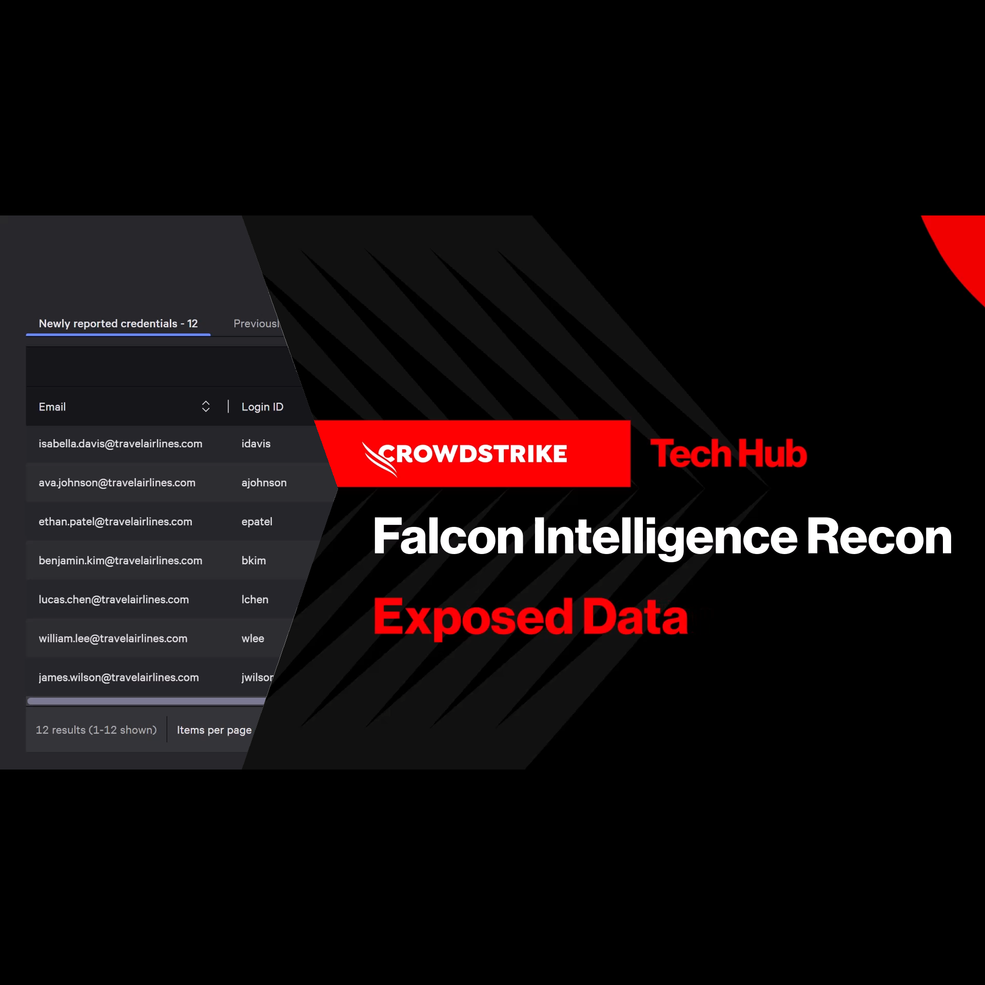
Adversary Intelligence - Exposed Credentials
Play Video
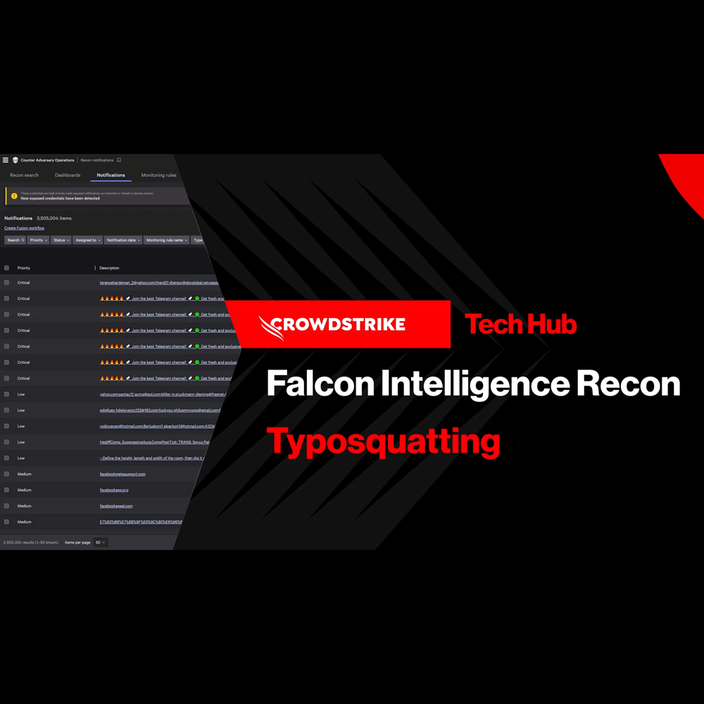
Adversary Intelligence - Typosquatting
Play Video
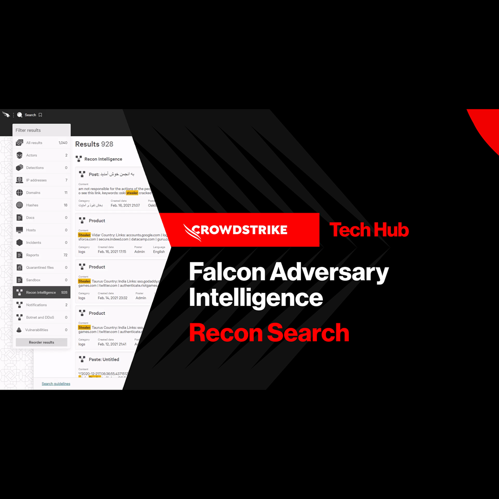
Adversary Intelligence - Recon Search
Play Video
Charlotte AI Agentic Detection Triage
Play Video
Charlotte AI Agentic Response
Play Video
Charlotte AI Agentic Workflows
Play Video
Charlotte AI AgentWorks

Play Video
Conversations with Charlotte AI: Rapid Assessment of Critical Detections
Play Video
Conversations with Charlotte AI: Assessing Potential Attacks
Play Video
View all content