


![Helping Non-Security Stakeholders Understand ATT&CK in 10 Minutes or Less [VIDEO]](https://assets.crowdstrike.com/is/image/crowdstrikeinc/video-ATTCK2-1?wid=530&hei=349&fmt=png-alpha&qlt=95,0&resMode=sharp2&op_usm=3.0,0.3,2,0)
![Qatar’s Commercial Bank Chooses CrowdStrike Falcon®: A Partnership Based on Trust [VIDEO]](https://assets.crowdstrike.com/is/image/crowdstrikeinc/Edward-Gonam-Qatar-Blog2-1?wid=530&hei=349&fmt=png-alpha&qlt=95,0&resMode=sharp2&op_usm=3.0,0.3,2,0)


?wid=2048&hei=1350&fmt=png-alpha&qlt=95,0&resMode=sharp2&op_usm=3.0,0.3,2,0)


CrowdStrike® employees like to say that there is big data, huge data and our data. To date, we have collected, analyzed and stored more than 15 petabytes of data, generated through hundreds of billions of daily security events. At the center of this massive data repository is CrowdStrike Threat Graph®, our custom-built, cutting-edge security analytics tool that collects high-fidelity telemetry from millions of endpoints around the globe and indexes them for quick and efficient access. Threat Graph currently manages approximately 2 trillion vertices, a truly staggering number. When creating CrowdStrike Threat Graph, the sheer volume of data wasn’t our only concern. Unlike many organizations, our data flow is not tied to predictable behavior patterns or the normal rhythm of business hours. As a result, our system needed to anticipate and absorb unexpected bursts of traffic in a very short period of time. Compounding matters was the fact that no existing tool on the market could perform at the level we needed — which suggested that what we were trying to achieve was at best unprecedented, and at worst, impossible.
Spoiler: It was possible. In this article, we discuss how Threat Graph was designed to operate with tremendous speed, flexibility and agility, and we share three best practices for engineers who may be tasked with building something similar.
1.
Overcome Limitations Through Innovation
As part of our evaluation process, we tested multiple off-the-shelf graph database solutions, all of which failed to live up to our team’s needs. We also consulted with many of the developers of these graph databases, trying to determine if there was a way to adapt them to deliver at our scale. This process did not identify a solution, but it did uncover a winning approach — to identify key elements of existing tools that, when taken together, could create the next-generation graph database we needed. For example, one of the concepts that we adopted was an “append only” approach to data collection. As the name implies, this means that records are never updated — only added. Rather than incur the higher cost of a typical read-modify-write operation, we instead decided that any modifications to a record would create a new record. This property helped reduce our database’s overall latency and consequently increased our throughput. For our purposes, this approach made sense because we needed a system that could support large bursts of writes. Meanwhile, our rate of read requests was relatively low and much more controllable. We place tremendous value on identifying malicious behavior quickly, but we need to have the data in order to make this determination. As such, we design systems like Threat Graph to favor collection and storage, equipping the necessary “dials” to keep the higher-cost analysis of this data at a predictable rate. In building Threat Graph this way, we identified a valuable trade off — one that aligns the priorities of the technology with the business strategy.
2.
Complexity Is The Enemy of Scale
At the outset of this project, the main issue we needed to address was managing an extremely large volume of data with a highly unpredictable write rate. At the time, we needed to analyze a few million events per day — a number that we knew would grow and is now in the hundreds of billions. The project was daunting, which is why we decided to step back and think not about how to scale, but how to simplify. We determined that by creating a data schema that was extraordinarily simple, we would be able to create a strong and versatile platform from which to build. So our team focused on iterating and refining until we got the architecture down to something that was simple enough to scale almost endlessly. In programming, one of the classic ways of representing a graph-like structure is a simple adjacency list, and that is essentially how we designed the schema for Threat Graph.
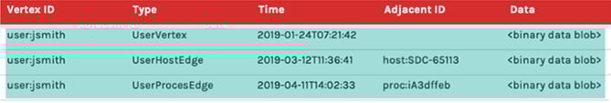
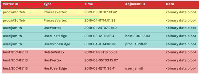 Figure 1. Example schema
Above, Figure 1. shows a representation of what a simplified Threat Graph schema could look like. One of the first things to notice is the use of a single table to represent both vertices and edges. This has the ability to retrieve all data about a desired vertex, including vertex details and edge relationships, by executing exactly one query in exactly one table. Furthermore, that query should be able to do a sequential read as the data is indexed to be contiguously based on the common vertex ID which is shared with vertex details and edges. This is possible because of the presence of a column (Type in this example) that allows us to distinguish what each row of data represents. The highlighting of the rows represents a few key concepts of what this schema is able to achieve: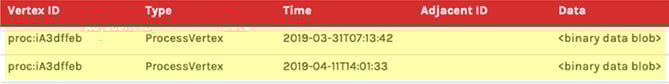
- Yellow rows highlight the “append-only” nature of this data model. Note that two rows have the same Vertex ID and are both of Type
ProcessVertex. Also note that the timestamps differ between the two rows. Imagine that we receive one request to mutate data aboutproc:iA3dffebon2019-03-31T07:13:42, which is the first record we’ve ever received about this process vertex. Later, we receive another request to mutate the data aboutproc:1A3dffeb. In this scenario, rather than overwrite the first row, we instead append a new row. If someone wants to know the current state of this vertex, we need to read both rows of TypeProcessVertexand have a strategy for handling collisions when two rows both want to mutate the same property.
- Cyan rows represent how we store all of the data for a vertex, including its details and edge relationships clustered together so they’re available to read efficiently. The UserVertex row with a Vertex ID of
user:jsmithrepresents the detail data for the vertex itself and would store this detail in the Data column. Immediately under it are aUserHostEdgeandUserProcessEdgethat have the same Vertex IDuser:jsmith. Notice, however, that unlike the vertex rows, the rows that represent edges have a value in the Adjacent ID column. The adjacency column is what makes this an adjacency-list, and it is what enables us to represent relationships between entities. Another cool callout is that the edges can also have their own data present in the Data column, which can be used to help inform traversal paths or just provide additional context.
- Red rows demonstrate how we account for “deleting” data. You’ll notice that the very first red row has a type DeleteVertex for Vertex ID
host:SDC-65113. Threat Graph guarantees that a delete marker will be the first row read, if it exists, when querying for anything about a vertex. This guarantee comes as a result of the way sort data in the index, ensuring delete records have a lower sort value than other records. Now we can short-circuit and stop reading any additional rows since this vertex is now considered deleted. This also demonstrates how we handle deletes in an append-only data model. We actually represent a delete by creating a new record.
What we’ve noticed over the years is that the simplicity of our design has really stood the test of time. One of the reasons why CrowdStrike has such a stellar scalability record is because our architecture is able to adapt to the needs of the market. Being clever and complicated might seem like an achievement in the moment, but it is much more difficult to manage over the long term.
3.
Shrink the Feedback Cycle
One of the guiding principles of Threat Graph is that we need to have visibility into change. At CrowdStrike, we’re dealing with the security of our customers — and by extension, we are protecting millions of their customers by stopping breaches — so it’s critical that we know what will happen as a result of every action we take. One of the simplest ways we gain visibility is by leveraging our metrics package. We use this information to make performance projections about our expectations before we deploy. Then, once we release, we monitor the results in real time, gather feedback on the changes introduced into production and confirm the outcomes are in line with our expectations. This tight cycle of feedback is incredibly useful when operating at this scale. In a general sense, this concept is nothing new. However, what makes CrowdStrike different is that we have made significant investments in the tooling around our metrics collection and visualization systems. We have comprehensive tooling that helps us understand our key performance indicators (KPIs) and anticipate what they mean for our customers. In following these three best practices, our team was able to create a solution that addressed our need to process a staggering amount of data without compromising speed or accuracy. Perhaps more importantly, the simplicity of our design enhances our ability to adapt and evolve Threat Graph to meet the demands of the future. Finally, the processes we have in place help ensure that we maintain visibility into how those changes will affect our system performance. As we see it, Threat Graph is a cutting edge-application — and our job is to make sure it stays that way. Does this work sound interesting to you? Visit CrowdStrike’s Engineering and Technology page to learn more about our engineering team, our culture and current open positions.
Additional Resources
- Learn more about the CrowdStrike Falcon®® platform by visiting the product webpage.
- Learn more about CrowdStrike endpoint detection and response by visiting the Falcon Insight™
webpage. - Test CrowdStrike next-gen AV for yourself. Start your free trial of Falcon Prevent™ today.


